Dark mode continues to grow in popularity as a convenient option for users to experience the web with less strain on the eyes. Let’s face it, we all tend to spend more time looking at screens than we probably should, so any additional comforts to the user experience (like dark mode) can go a long way. Operating Systems, programs, and browsers usually include built-in dark mode capabilities, but some developers are taking it to another level by including a custom dark mode experience for their website. The idea is to take more control over how their website looks in dark mode without having to compromise on branding and/or design.
In this tutorial, we are going to show you how to create a custom dark mode toggle in Divi from scratch without a plugin. With this dark mode toggle functionality, you will have control over the dark mode design and have a better user experience tailored to your brand.
Let’s get started!
Sneak Peek
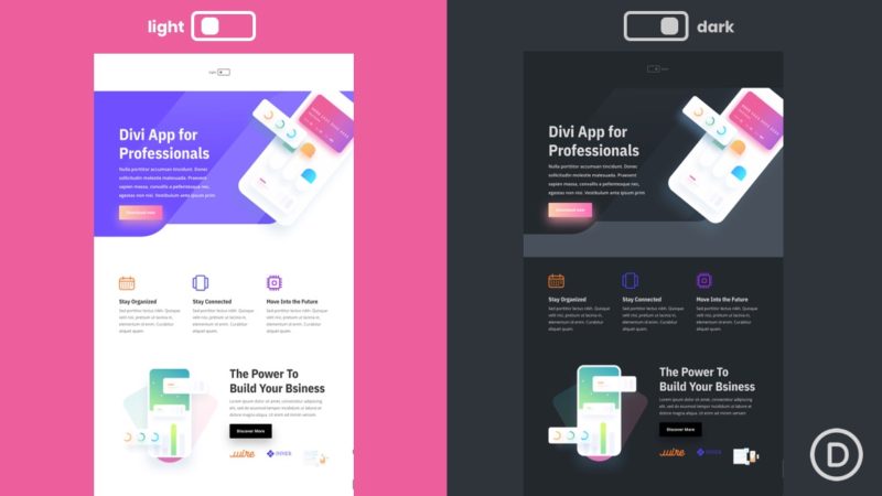
Here is a quick look at the design we’ll build in this tutorial.
Here is the custom dark mode toggle we will build.
And here is the before and after for the dark mode applied to one of our premade layouts.
And here is the dark mode toggle added to a global header. Notice how the light/dark mode remains as you navigate the site.
Download the Layout for FREE
To lay your hands on the designs from this tutorial, you will first need to download it using the button below. To gain access to the download you will need to subscribe to our Divi Daily email list by using the form below. As a new subscriber, you will receive even more Divi goodness and a free Divi Layout pack every Monday! If you’re already on the list, simply enter your email address below and click download. You will not be “resubscribed” or receive extra emails.
You have successfully subscribed. Please check your email address to confirm your subscription and get access to free weekly Divi layout packs!
To import the section layout to your Divi Library, navigate to the Divi Library.
Click the Import button.
In the portability popup, select the import tab and choose the download file from your computer.
Then click the import button.
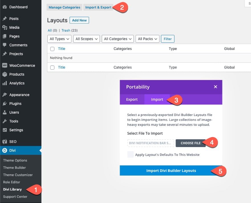
Once done, the section layout will be available in the Divi Builder.
Let’s get to the tutorial, shall we?
What You Need to Get Started

To get started, you will need to do the following:
- If you haven’t yet, install and activate the Divi Theme.
- Create a new page in WordPress and use the Divi Builder to edit the page on the front end (visual builder).
- Choose the option “Build From Scratch”.
After that, you will have a blank canvas to start designing in Divi.
Part 1: Building the Dark Mode Toggle
In this first part of the tutorial, we are going to build a dark mode toggle with a page in Divi. Once the toggle is created with the code, you will be able to save it to the Divi Library and add it to any place on your website.
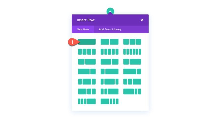
To start, add a one-column row to the default section while building with Divi on the front end from scratch.
Add Blurb
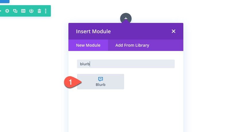
To build the custom toggle, we are going to design a blurb module with a little custom CSS.
Add a new blurb module to the row.
Content
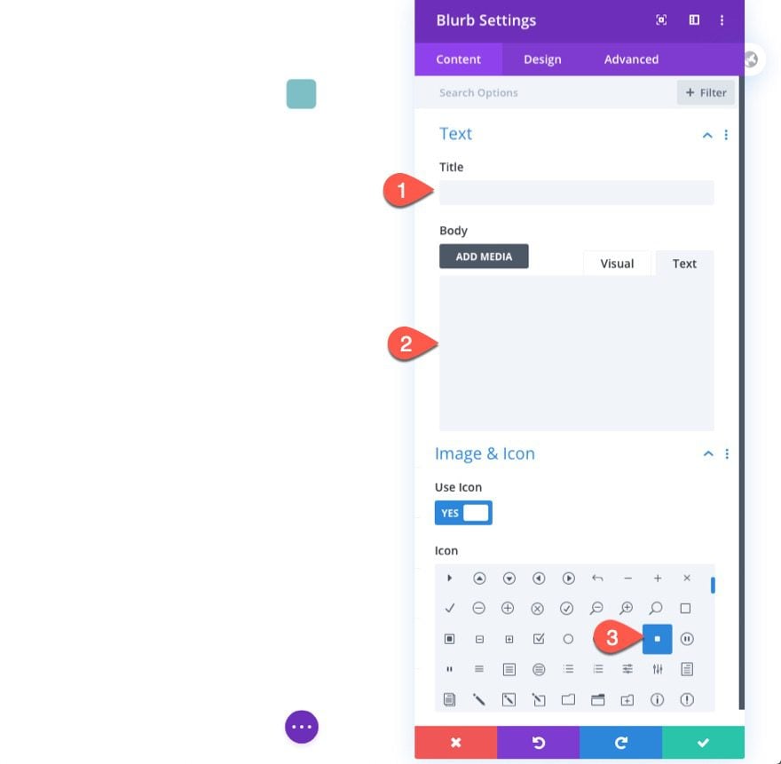
Take out the default mock content for the title and body. Then add the square icon in place of the image.
Design
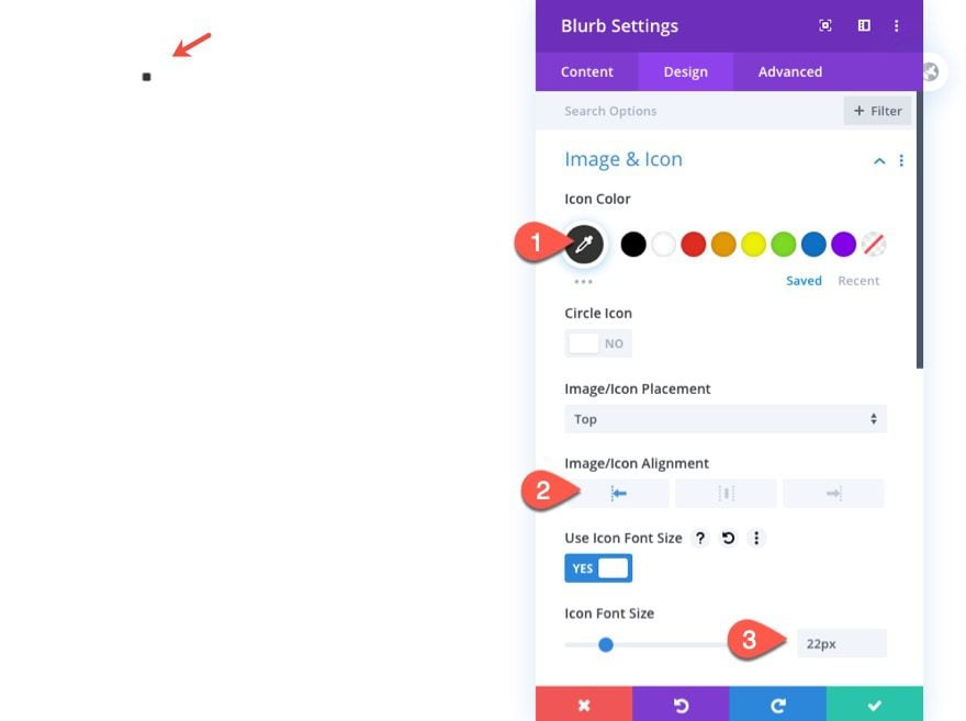
Jump over to the design settings and update the following:
- Icon Color: #666666
- Image/Icon Alignment: Left
- Icon Font Size: 22px
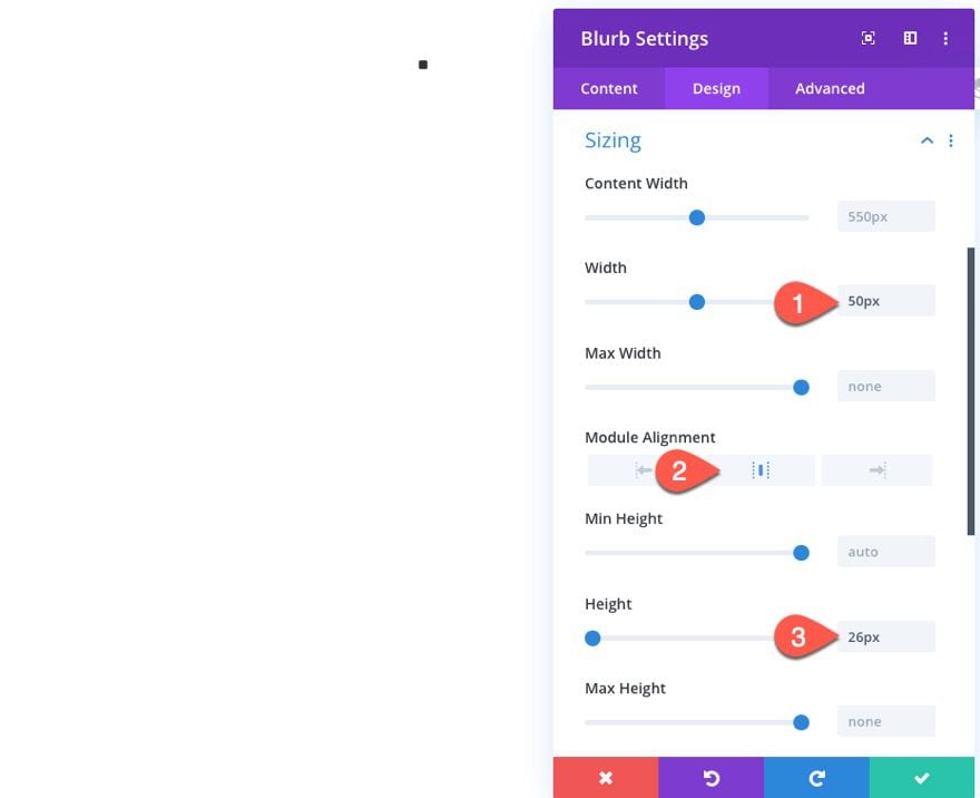
- Width: 50px
- Module Alignment: center
- Height: 25px
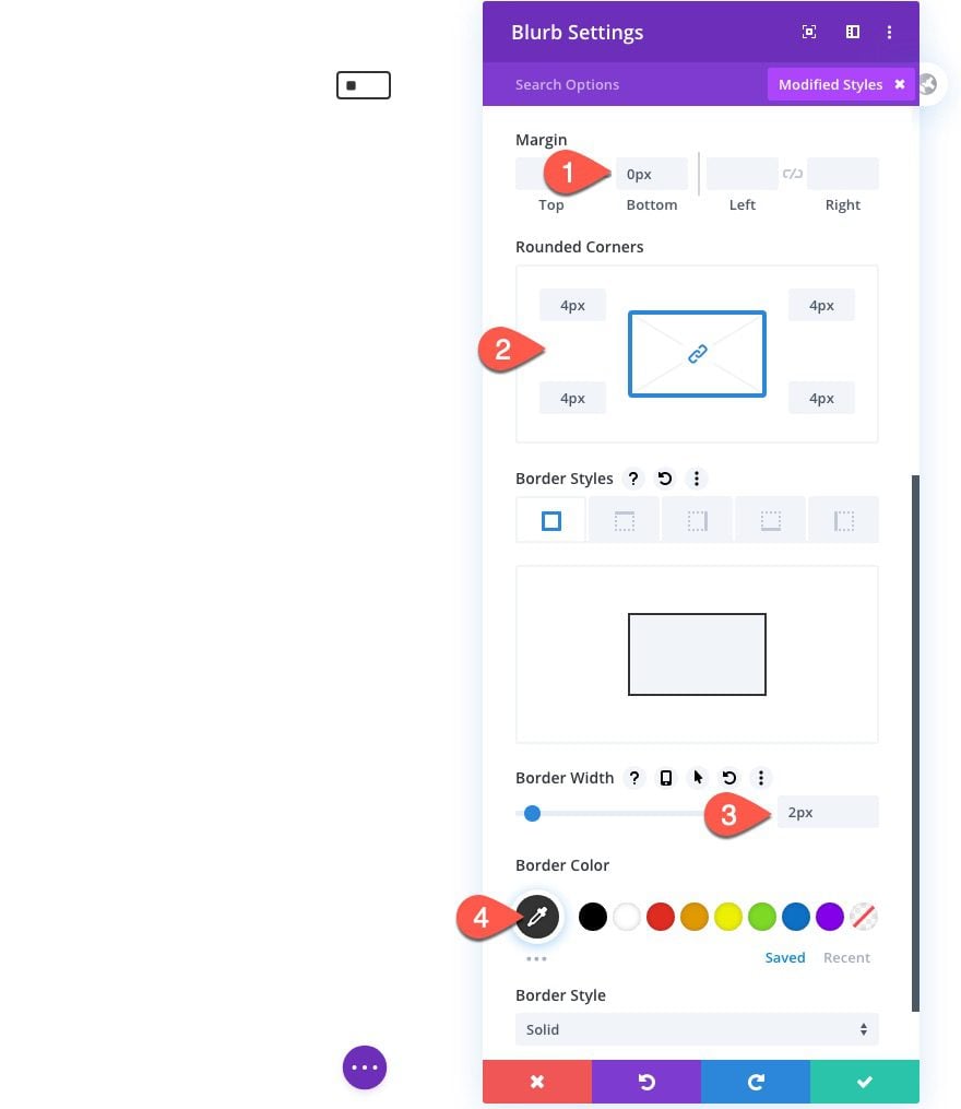
- Margin: 0px bottom
- Rounded Corners: 4px
- Border Width: 2px
- Border Color: #666666
Custom CSS
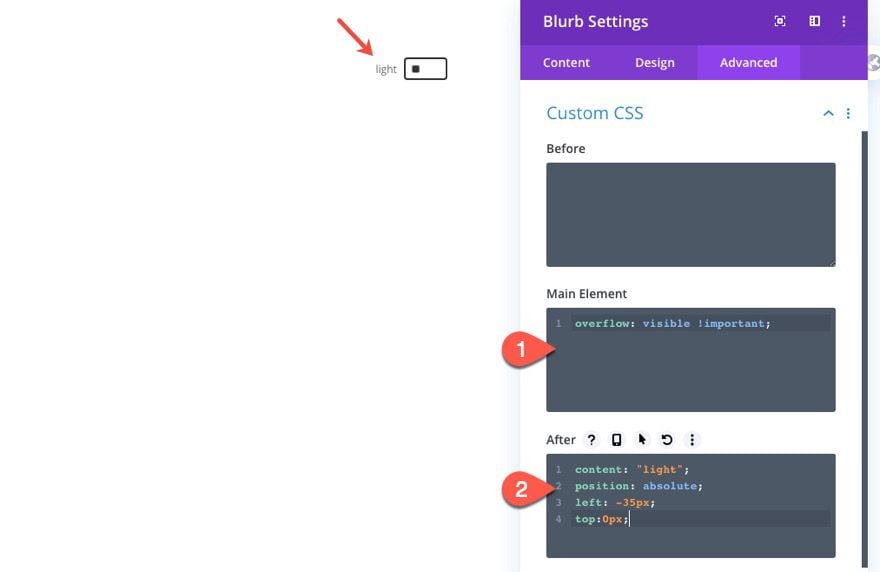
Once the design is in place, jump over to the advanced tab. Under the custom CSS, add the following custom CSS to the main element in order to make sure the overflow isn’t hidden from the rounded corners styling.
overflow: visible !important;
Then add the following custom CSS to the After element:
content: "light";
position: absolute;
left: -35px;
top:0px;
This adds a label to the blurb module that we will change from “light” to “dark” on click.
Body Text Design
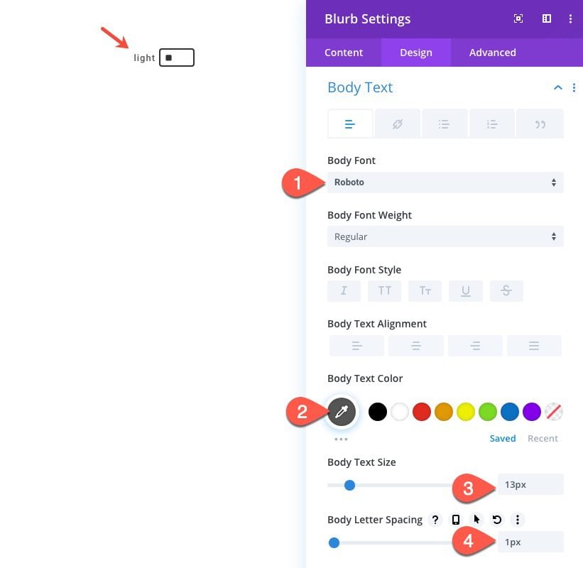
Since the text in the after pseudo-element inherits the body text styles, we can add the body text styles using the Divi options as follows:
- Body Font: Roboto
- Body Text Color: #666666
- Body Text Size: 13px
- Body Letter Spacing: 1px
Adding Custom Code with a Code Module
To add the necessary Code (CSS/JQuery) to make the dark mode toggle work its magic, we will use a code module.
Create a new code module under the blurb module in the same column.
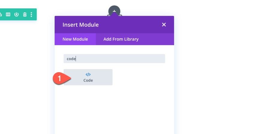
Then paste in the following code in the code box:
<style>
/**
* Dark Mode Toggle Styles
*/
.et-dark-mode {
transition: all .5s;
}
.et-dark-toggle {
cursor: pointer;
transition: all .5s;
}
body.et-dark-mode .et-dark-toggle {
border-color: #666666;
}
body.et-dark-mode .et-dark-toggle:after {
content:"dark";
color: #666666;
left: 54px;
}
body.et-dark-mode .et-dark-toggle .et_pb_blurb_content {
text-align:right;
}
body.et-dark-mode .et-dark-toggle .et-pb-icon {
color: #666666;
}
/**
* Body Dark Mode Style
*/
body.et-dark-mode {
background-color: #23282d !important;
}
/**
* Divi Element Dark Mode Styles
*
* Here you can add styling for each Divi Element that has the class "et-dark-mode-capable".
*/
/* Section with dark mode */
.et_pb_section.et-dark-mode-capable.et-dark-mode {
background-color: #23282d !important;
background-blend-mode: overlay;
transition: opacity .5s ease-in-out;
color: #dddddd !important;
}
/* Row with dark mode */
.et_pb_row.et-dark-mode-capable.et-dark-mode {
background-color: #23282d !important;
color: #dddddd !important;
}
/* Column with dark mode */
.et_pb_column.et-dark-mode-capable.et-dark-mode {
background-color: #23282d !important;
color: #dddddd !important;
}
/* Module with dark mode */
.et_pb_module.et-dark-mode-capable.et-dark-mode {
background-color: transparent !important;
color: #dddddd !important;
}
/* Text Headings with dark mode */
.et_pb_module.et-dark-mode-capable.et-dark-mode.et_pb_module_header,
.et_pb_module.et-dark-mode-capable.et-dark-mode h1,
.et_pb_module.et-dark-mode-capable.et-dark-mode h2,
.et_pb_module.et-dark-mode-capable.et-dark-mode h3,
.et_pb_module.et-dark-mode-capable.et-dark-mode h4,
.et_pb_module.et-dark-mode-capable.et-dark-mode h5,
.et_pb_module.et-dark-mode-capable.et-dark-mode h6 {
color: #dddddd !important;
}
</style>
<script>
function storageAvailable(type) {
try {
var storage = window[type],
x = '__storage_test__';
storage.setItem(x, x);
storage.removeItem(x);
return true;
}
catch(e) {
return e instanceof DOMException && (
// everything except Firefox
e.code === 22 ||
// Firefox
e.code === 1014 ||
// test name field too, because code might not be present
// everything except Firefox
e.name === 'QuotaExceededError' ||
// Firefox
e.name === 'NS_ERROR_DOM_QUOTA_REACHED') &&
// acknowledge QuotaExceededError only if there's something already stored
storage.length !== 0;
}
}
jQuery(document).ready(function($) {
var storageAvailable = window.storageAvailable('sessionStorage');
$(".et-dark-toggle").click(function() {
$(".et-dark-mode-capable,body").toggleClass("et-dark-mode");
if ( storageAvailable ) {
$("body").hasClass("et-dark-mode") ?
sessionStorage.setItem('etDarkModeEnabled','1'):
sessionStorage.removeItem('etDarkModeEnabled');
}
});
if (storageAvailable) {
'1' == sessionStorage.getItem('etDarkModeEnabled') ?
$(".et-dark-mode-capable,body").addClass("et-dark-mode"):
$(".et-dark-mode-capable,body").removeClass("et-dark-mode");
}
});
</script>
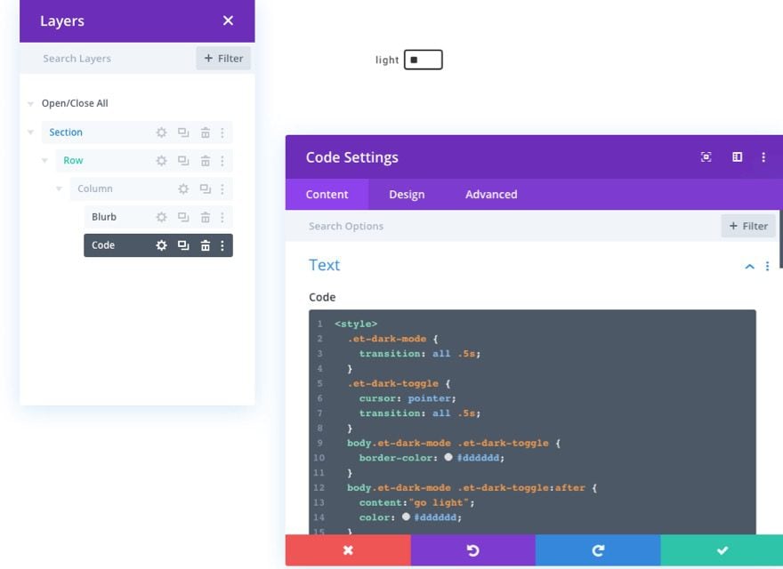
Adding the Custom CSS Classes
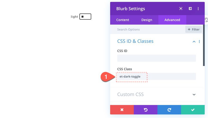
The custom code requires that you have a custom CSS Class added to the blurb module or toggle. This will allow the blurb to trigger the dark mode toggle and functionality on click.
Blurb Module Class
Open the blurb module settings and add a custom CSS Class as follows:
- CSS Class: et-dark-toggle
Dark Mode Capable Class
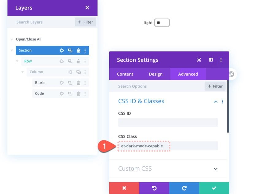
We also need to add a custom CSS Class to every Divi element that we want to have the capability of dark mode. Once the element has the CSS Class, that element will inherit the “dark mode” custom CSS in the code we added once dark mode has been toggled on. This method gives us more control over our dark mode design since some elements may not require any dark mode styles.
To start, we can add the dark mode to the section containing our dark mode toggle.
Open the section settings and add the following CSS Class:
- CSS Class: et-dark-mode-capable
Part 2: Adding Dark Mode Functionality to a Divi Page
Now that we have the code and CSS Classes in place, we are ready to apply the dark mode functionality and design to an entire page in Divi. To do this we are going to use our Mobile App Landing Page Premade Layout.
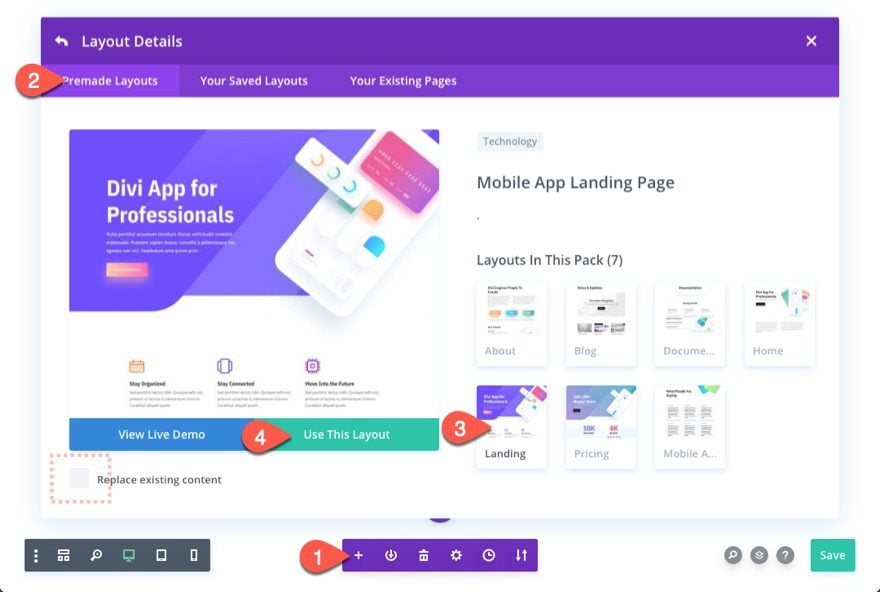
To add the layout, open the settings menu at the bottom of the visual builder and click the Add New Layout icon.
Then select the Mobile App Landing Page layout from under the premade layouts tab.
Make sure the “Replace existing content” option is NOT selected. You don’t want to erase the section with the dark mode toggle.
Since the dark mode style will only apply to elements with the CSS Class “et-dark-mode-capable”, we can choose to add to page a few different ways.
- We can add the CSS Class to each element on the page individually.
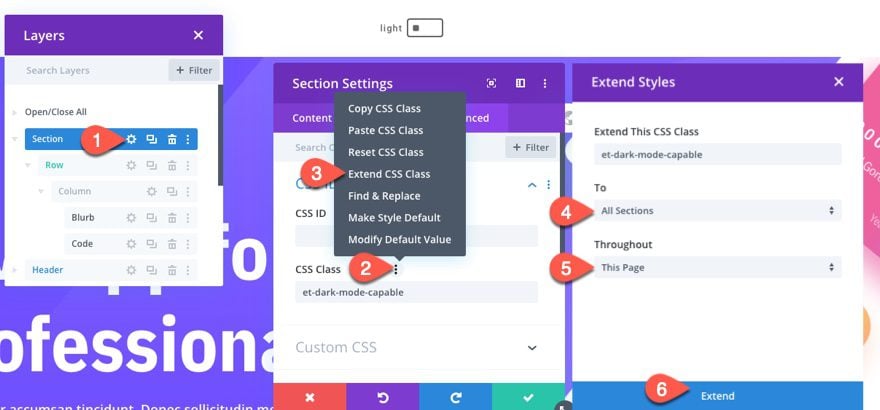
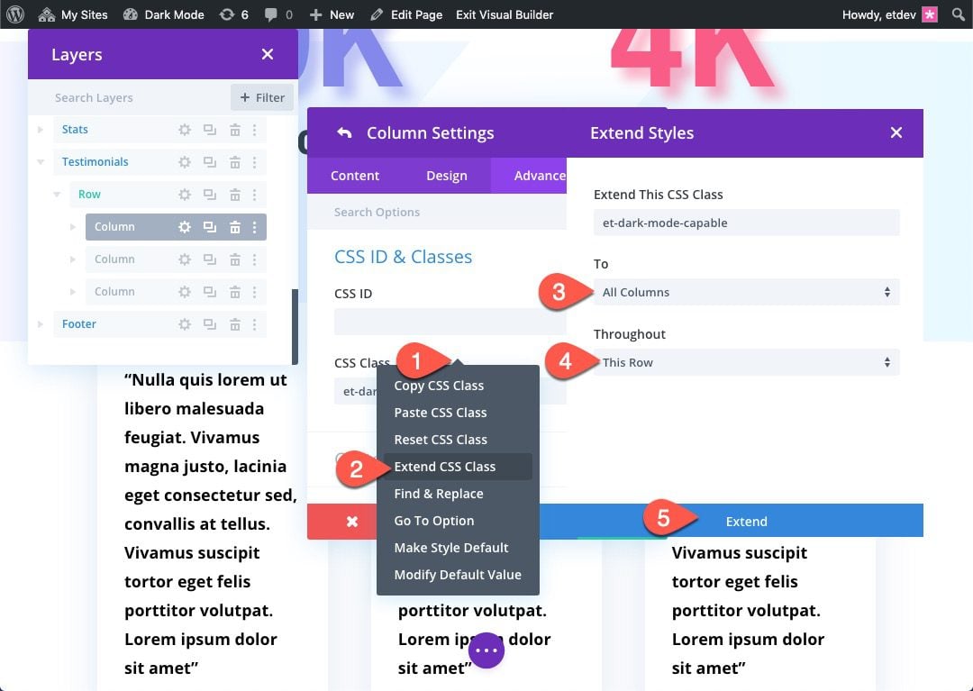
- We could extend the CSS Class to elements throughout the page (this would be quicker than doing each one manually). For example, we could open the section settings for the top section and extend the CSS Class for that section to all sections throughout the page.

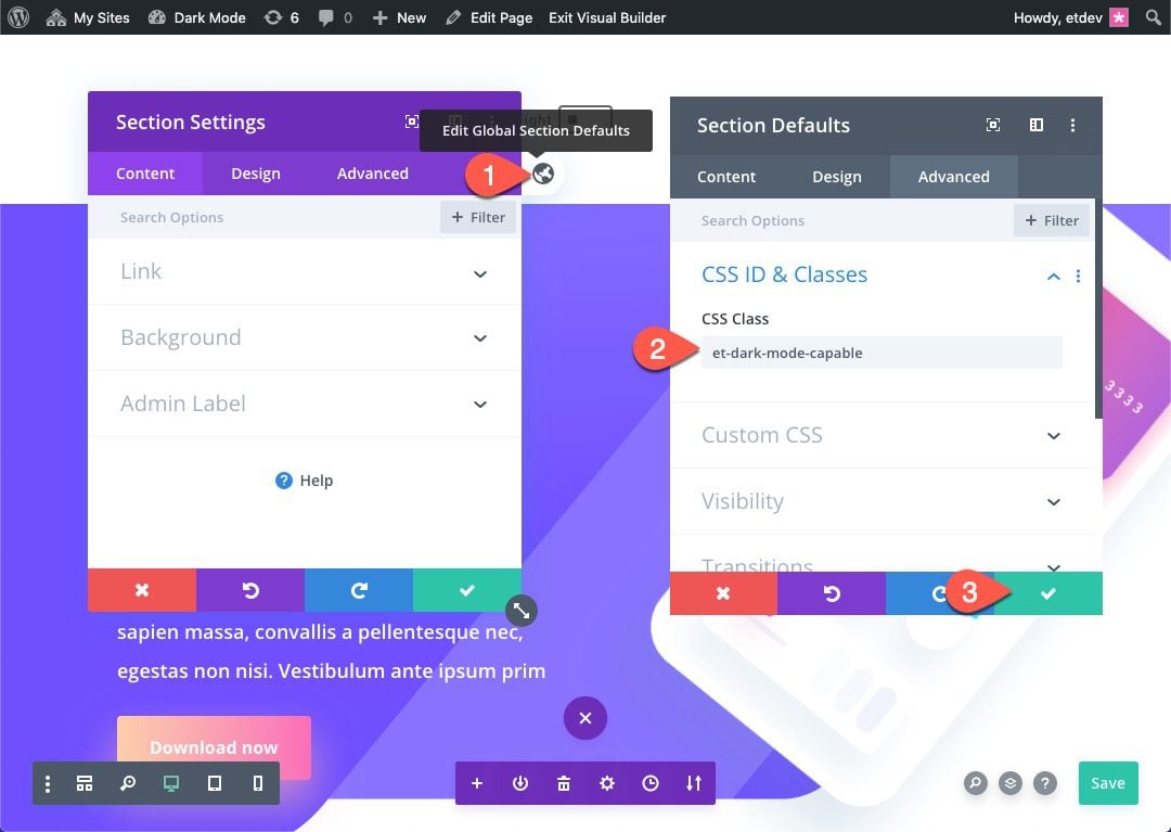
- We can add the CSS Class to the Global Defaults of the element. This will apply the CSS Class to all the elements site-wide, adding dark mode capability throughout the entire site. For example, we could open the section settings and click the global default icon to edit the Global Section Defaults. Then we can add the CSS Class and save it as a CSS Class for all sections site-wide.

Adding the CSS Class to Page Elements
For this example, we are going to update the page elements by adding the CSS Class to the Global Defaults to the sections and text modules. And we will also make a few additions to the other elements on the page as we go.
All Sections
To add the CSS Class to all the sections, open the settings for top section that contains the dark mode toggle. Then edit the global defaults for the section and add the following CSS Class to the Section Global Defaults:
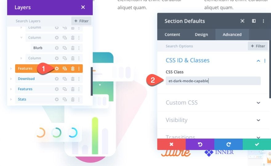
- CSS Class: et-dark-mode-capable
All Specialty Sections
Add the CSS Class to the global defaults of the specialty section as well.
Text Modules
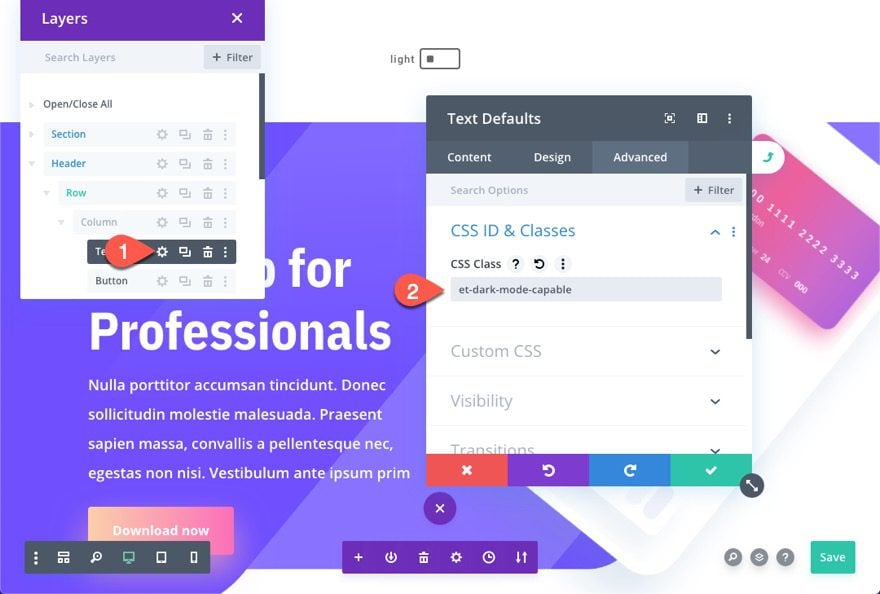
Next, open the settings for one of the text modules on the page and add the same CSS Class to the Text Global Defaults.
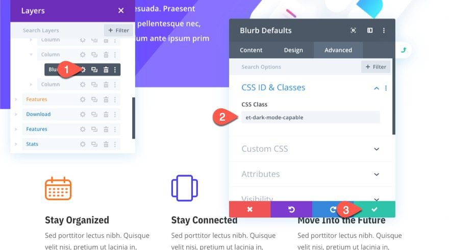
Blurbs
Next, open the settings for one of the blurbs in the page layout and add the CSS Class to the Blurb Global Defaults.
Testimonial Columns
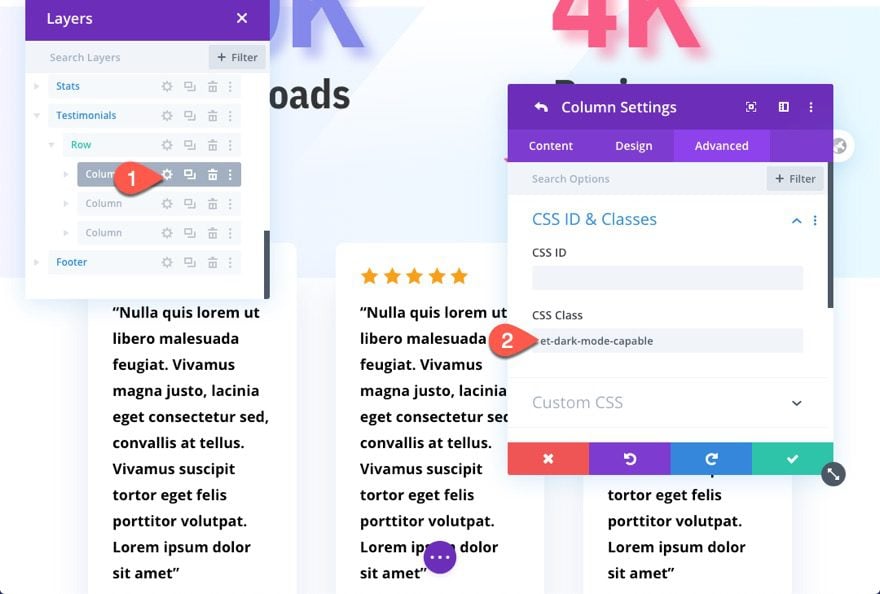
Further down the page layout, there are a few testimonials, each inside a column with a custom white background. To override the column styles in dark mode, add the CSS class to one of the columns and extend it to the other columns within the row.
NOTE: It isn’t a great idea to add the CSS Class to the column’s global defaults because that will break some of the design elements (ie. its not a good idea to give all columns a dark background when most of the time column backgrounds are transparent).
To test out the result, jump over to the live page and click on the dark mode toggle at the top of the page.
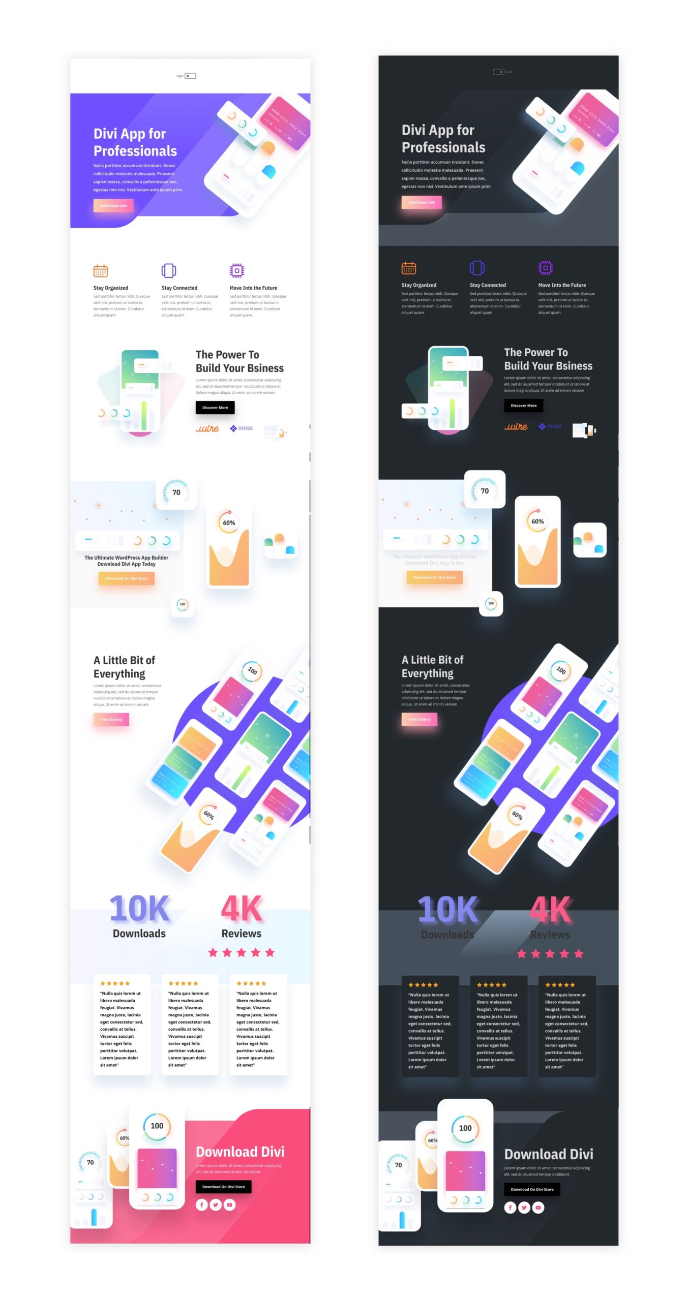
Here is what the page should look like in light mode.

And here is what the page should look like in dark mode.

Part 3: Adding the Dark Mode Toggle to a Global Header
If you want to extend the dark mode functionality site-wide, it would be a good idea to add the dark mode toggle to you Divi Global Header. That way it will be available to users site-wide in one convenient place.
Saving the Dark Mode Toggle and Code to the Divi Library
But before you do that, we need to save the dark mode toggle and code to the Divi Library. This will make it easier to add to other areas of our site, including the global header.
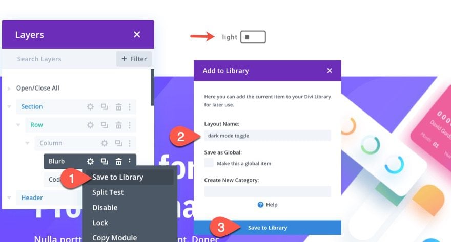
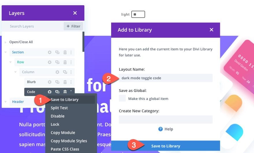
Go back to the layout we built with Divi deployed on the front end. Then open the menu for the blurb module used to build the dark mode toggle and select save to library. Give the layout a name and save it to the library.
Next, save the code module to the Divi Library as well.
Importing a Premade Global Header Template
If you don’t already have a global header, you will need to build your own or use one of our premade theme builder packs.
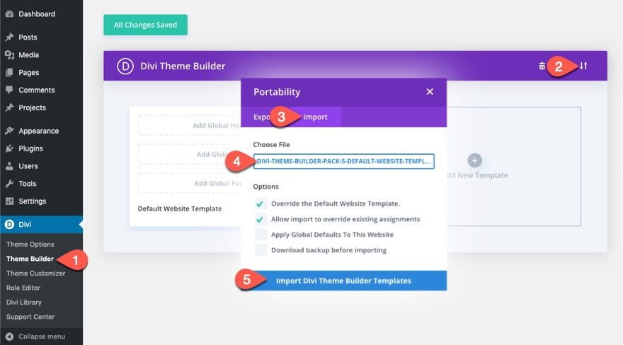
For this tutorial, we are going to use the global header included in the fifth theme builder pack. To add the global header using the theme builder, you will need to download the theme builder pack and then use the portability options to import the JSON file called “divi-theme-builder-pack-5-default-website-template.json”.
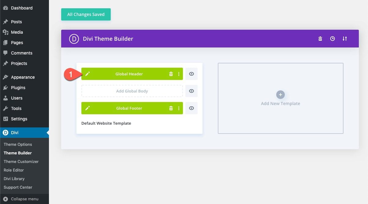
Once the template has been loaded, click to edit the Global Header.
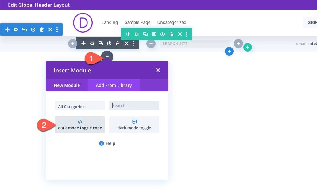
Then add the dark mode toggle from the library to column 1 in the second row of the header.
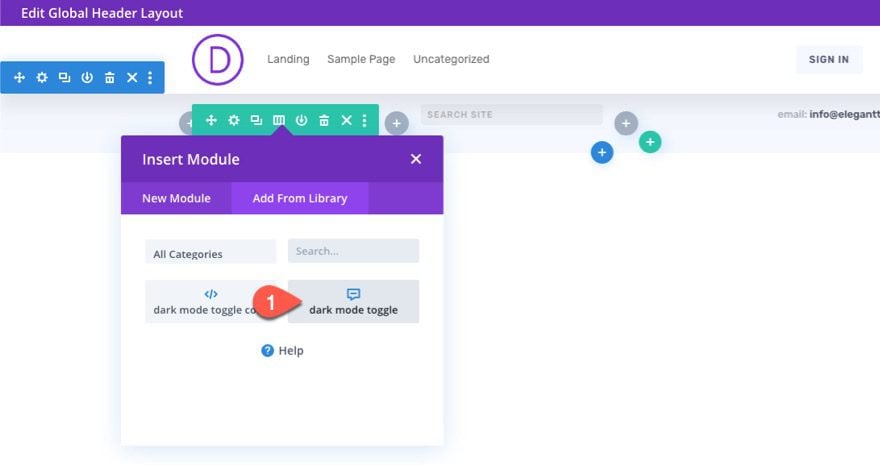
Under the dark mode toggle/blurb module, add the code module you have saved to the library directly under the dark mode toggle.
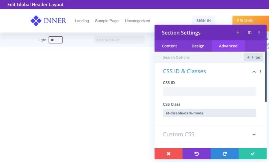
Since we have the “et-dark-mode-capable” CSS Class as the default for all sections, the sections inside the header will also have it by default. To disable this, simply give it an overriding CSS Class.
Final Results
Here are the final results of our dark mode toggle page.

And here is the dark mode toggle on the header. The selected mode (dark or light) will remain as you navigate to other pages on the site.
Adjusting the Custom CSS Dark Mode Styles
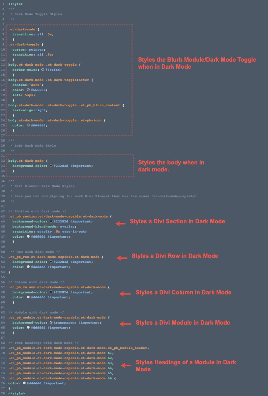
If you want to adjust the dark mode style of the toggle or Divi elements, you will need to do so inside the code within the code module.
The code currently has only a basic dark mode style applied to each of the elements once in dark mode. This consists of a dark background color and a light text color.
Final Thoughts
Equipping your Divi site with a custom Dark Mode toggle can be a great way to boost the UX and create a whole new design that both pleases and eases the eye. Hopefully, it comes in handy for you.
I look forward to hearing from you in the comments.
Cheers!
Keep reading the article at Elegant Themes Blog. The article was originally written by Jason Champagne on 2020-05-20 12:00:00.
The article was hand-picked and curated for you by the Editorial Team of WP Archives.

