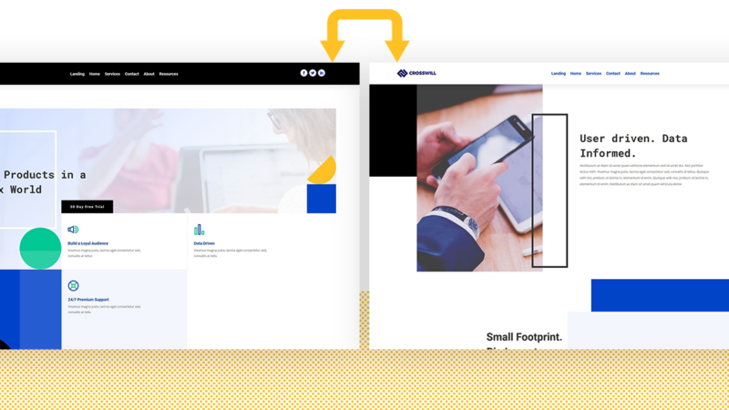
Your header inevitably remains one of your website’s most important elements. It influences your visitors’ navigation process and allows them to find what they’re looking for in a heartbeat. Now, if you’re looking for a way to swap your Divi header on scroll with another one, you’re going to enjoy this post. We’ll show you exactly how to pull it off with Divi’s theme builder, built-in elements and some additional code. We’re also making sure there’s some auto-generated placeholder space for the header at the top of your page. You’ll be able to download the JSON file for free as well!
Let’s get to it.
Preview
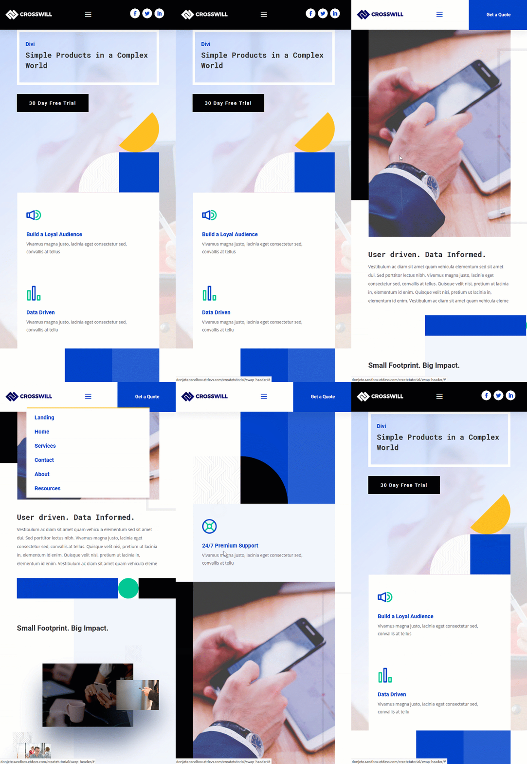
Before we dive into the tutorial, let’s take a quick look at the outcome across different screen sizes.
Desktop
Mobile
Download The Swap Divi Header Template for FREE
To lay your hands on the free swap Divi header template, you will first need to download it using the button below. To gain access to the download you will need to subscribe to our Divi Daily email list by using the form below. As a new subscriber, you will receive even more Divi goodness and a free Divi Layout pack every Monday! If you’re already on the list, simply enter your email address below and click download. You will not be “resubscribed” or receive extra emails.
You have successfully subscribed. Please check your email address to confirm your subscription and get access to free weekly Divi layout packs!
1. Go to Divi Theme Builder & Start Building Global Header
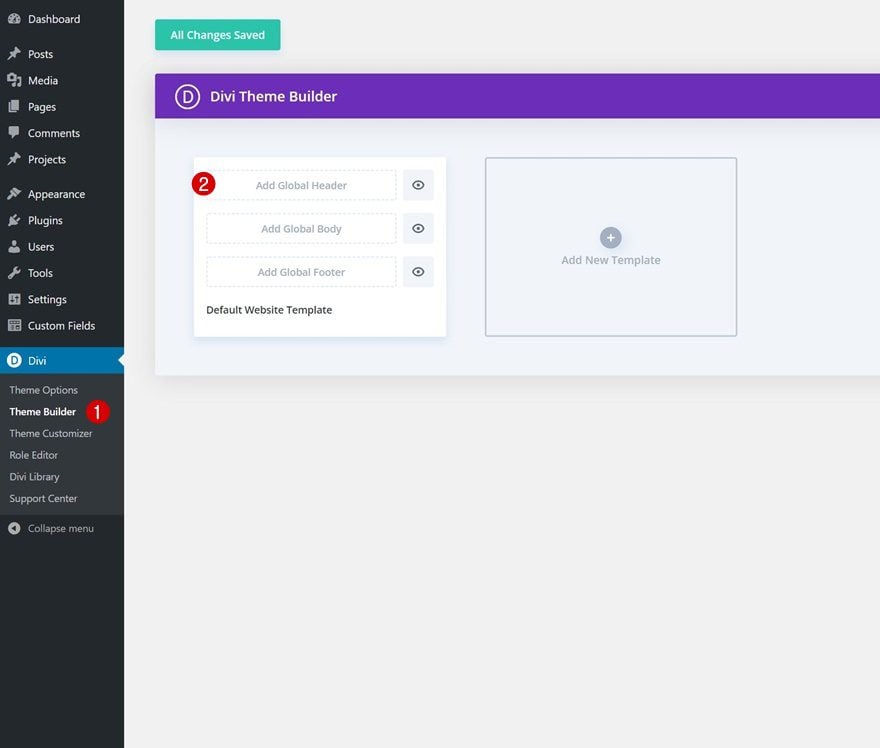
Go to Divi Theme Builder
Start by going to the Divi Theme Builder in the backend of your WordPress website and click on ‘Add Global Header’.
Build Global Header
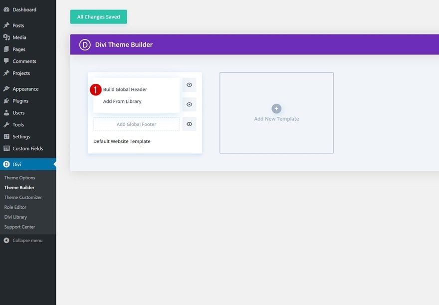
Then, click on ‘Build Global Header’ to be redirected to the template editor.
2. Create Both Headers in the Same Section
Modify Section
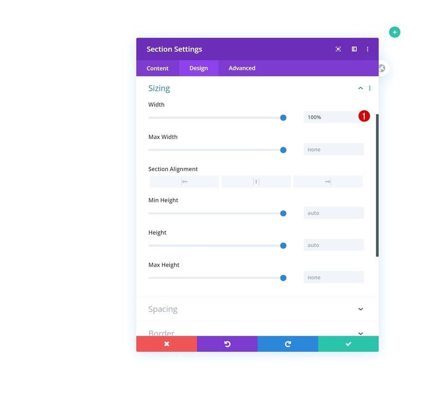
Sizing
Once inside the template editor, you’ll notice a section. Open the section settings and make sure the section width is ‘100%’.
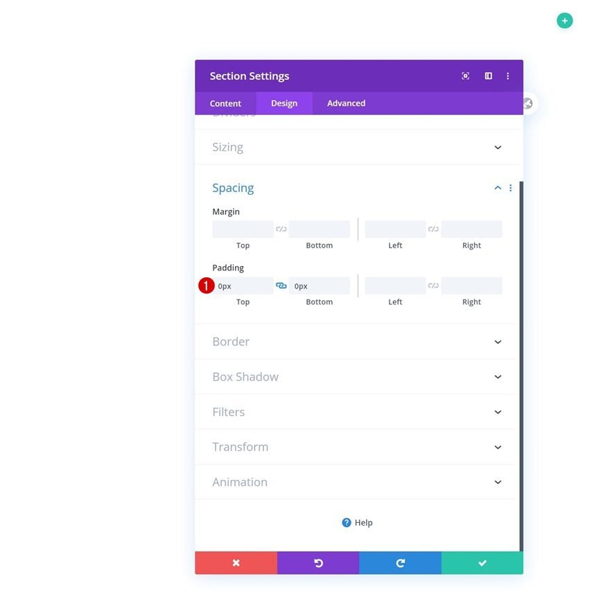
Spacing
Then, go to the spacing settings and remove all default top and bottom padding.
- Top Padding: 0px
- Bottom Padding: 0px
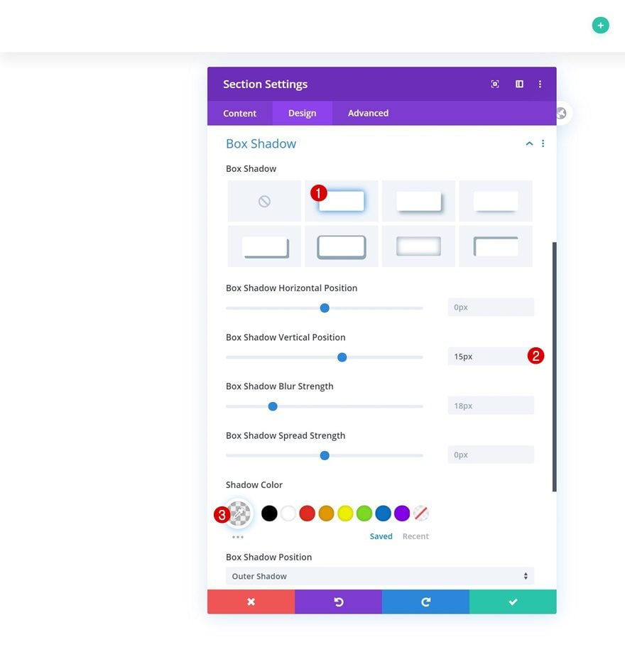
Box Shadow
We’re using a subtle box shadow as well.
- Box Shadow Vertical Position: 15px
- Shadow Color: rgba(0,0,0,0.06)
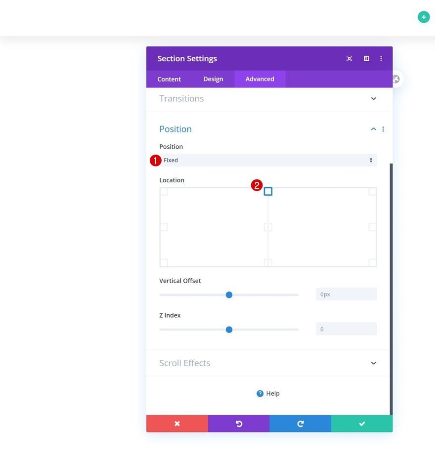
Position
Last but not least, we’ll make the section stick to the top center of our page using the position settings in the advanced tab.
- Position: Fixed
- Location: Top Center
Add Row Header #1
Column Structure
Both headers we’ll create will be part of the same section. We’ll use a separate row for each header. Add the first row header using the following column structure:
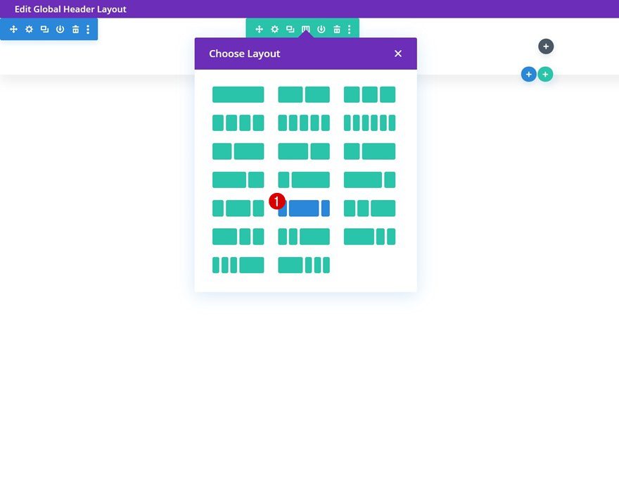
Background Color
Without adding any modules yet, open the row settings and change the background color.
- Background Color: #000000
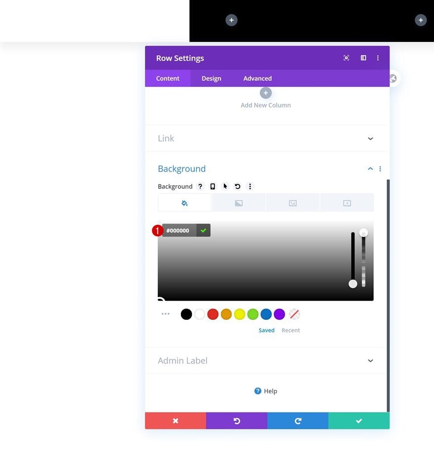
Sizing
Modify the sizing settings as well.
- Use Custom Gutter Width: Yes
- Gutter Width: 1
- Width: 100%
- Max Width: 100%
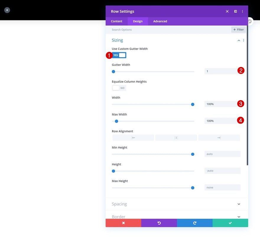
Spacing
Then, go to the spacing settings and remove all default top and bottom padding.
- Top Padding: 0px
- Bottom Padding: 0px
Main Element
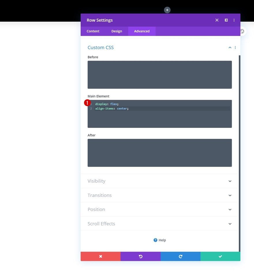
Complete the row settings by adding two lines of CSS code to the row’s main element. This CSS code will help us align all column content.
display: flex;
align-items: center;
Add Image Module to Column 1
Upload Image
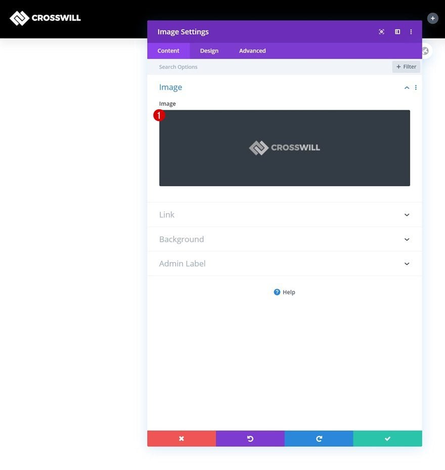
Time to add modules, starting with an Image Module in column 1. Upload a logo of your choice.
Alignment
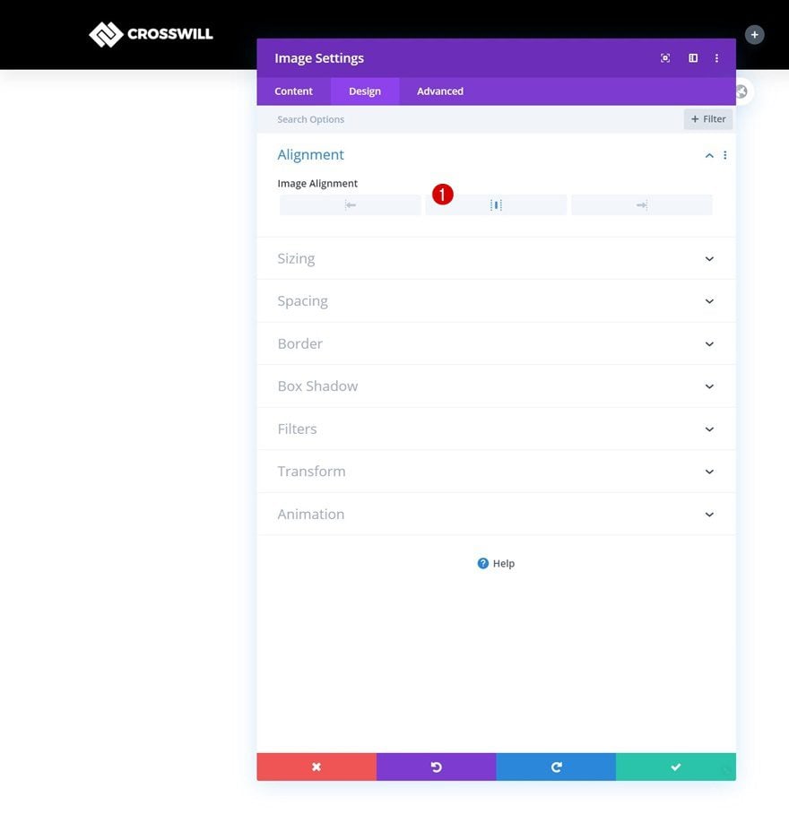
Change the module’s alignment next.
Add Menu Module to Column 2
Select Menu
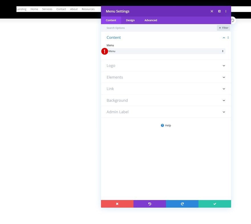
In the second column, the only module we need is a Menu Module. Select a menu of your choice.
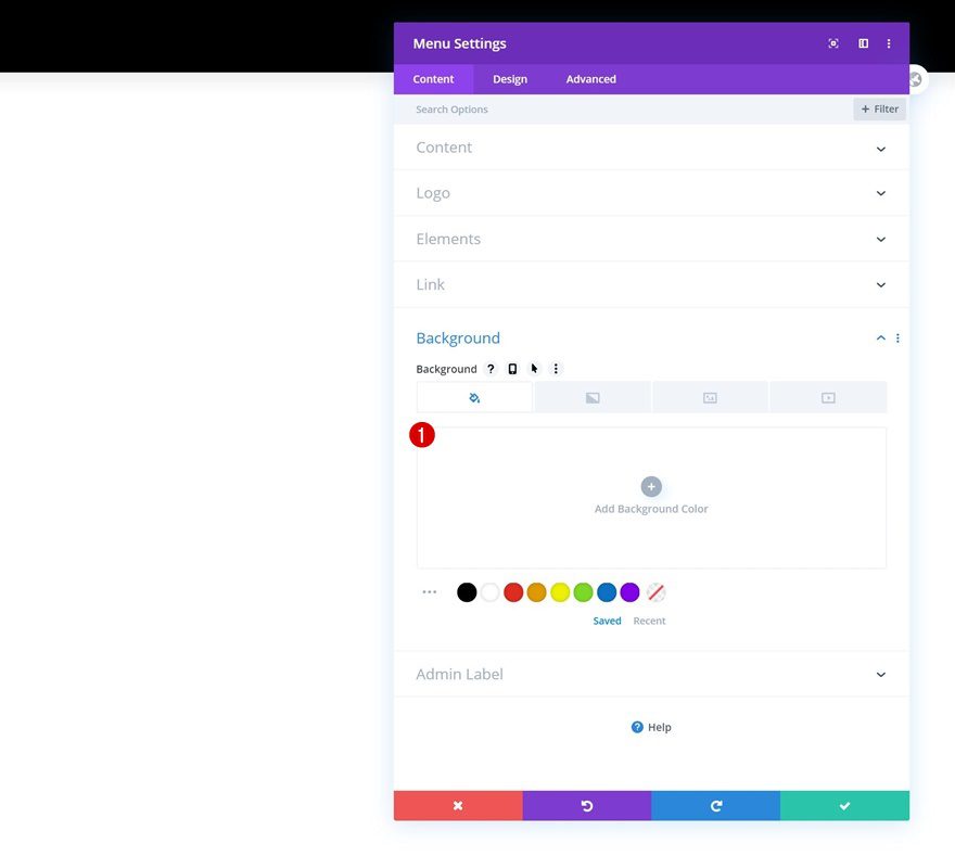
Remove Background Color
Remove the module’s background color next.
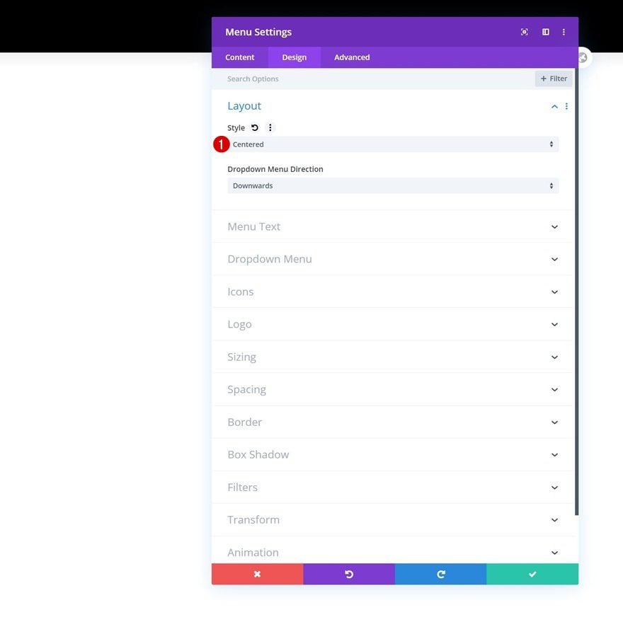
Layout
Move on to the design tab and change the layout accordingly:
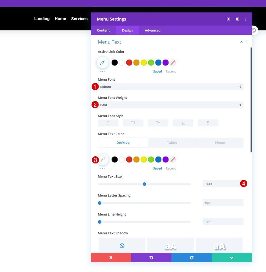
Menu Text Settings
Then, make some changes to the menu text settings.
- Menu Font: Roboto
- Menu Font Weight: Bold
- Menu Text Color: #ffffff (Desktop), #000000 (Tablet & Phone)
- Menu Text Size: 18px
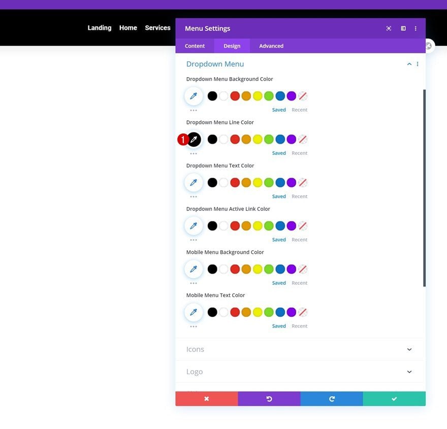
Dropdown Menu Text Settings
Next, we’ll change the dropdown menu line color in the dropdown menu text settings.
- Dropdown Menu Line Color: #000000
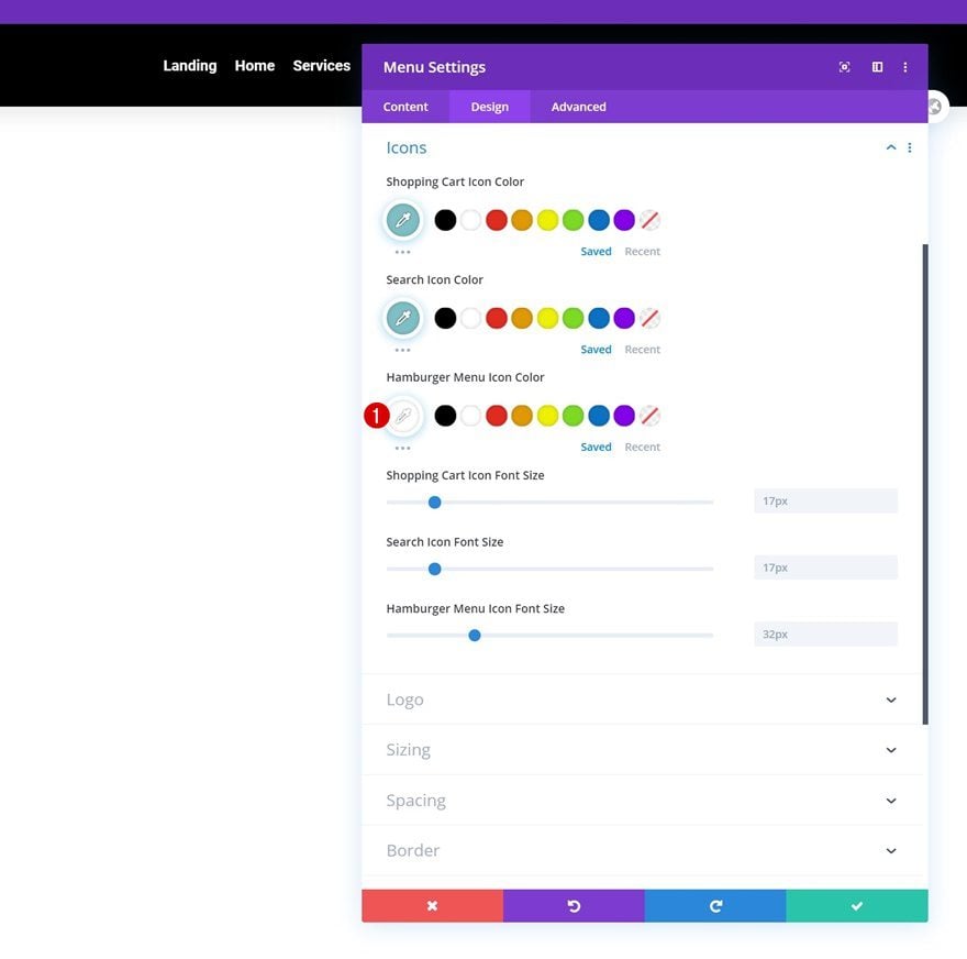
Icons Settings
We’re also changing the hamburger menu icon color.
- Hamburger Menu Icon Color: #ffffff
Spacing
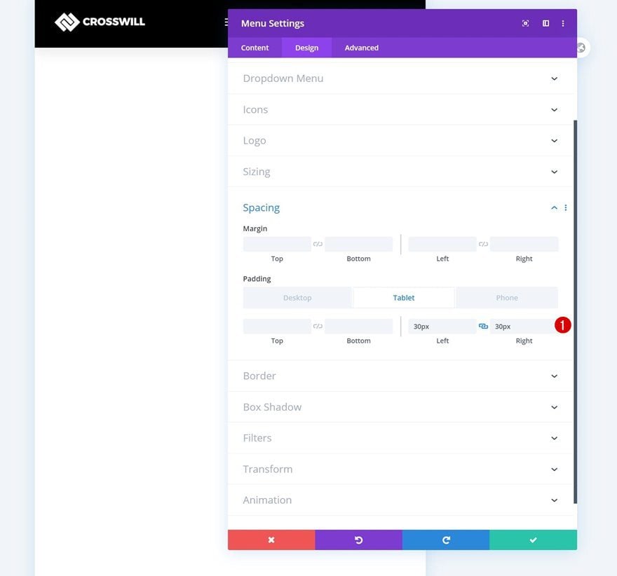
Complete the module settings by adding some custom left and right padding on smaller screen sizes.
- Left Padding: 30px (Tablet & Phone Only)
- Right Padding: 30px (Tablet & Phone Only)
Add Social Media Follow Module to Column 3
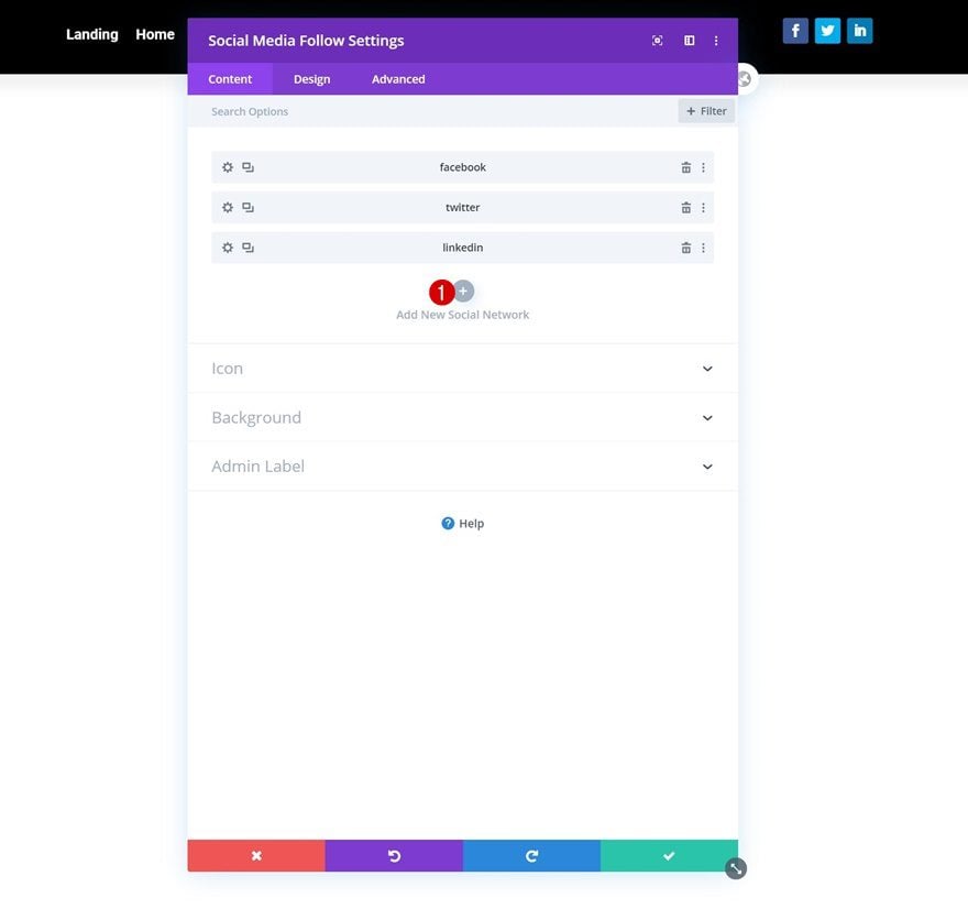
Add Social Networks of Choice
In the last column, the only module we need is a Social Media Follow Module. Add the social networks of your choice.
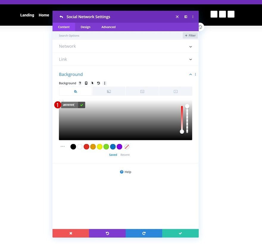
Individual Social Network Background Color
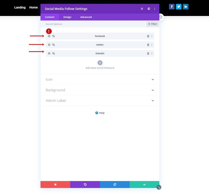
Then, open each social network individually and change the background color to white.
- Background Color: #FFFFFF
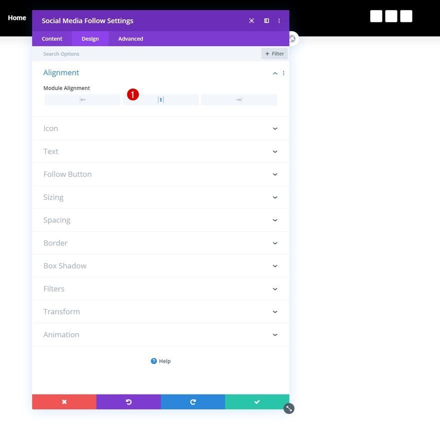
Alignment
Go back to the module’s general settings and change the module alignment.
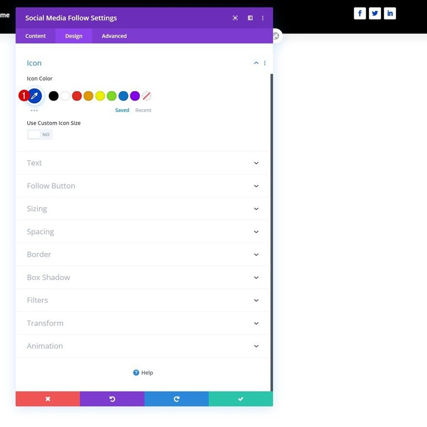
Icon Settings
Modify the icon color too.
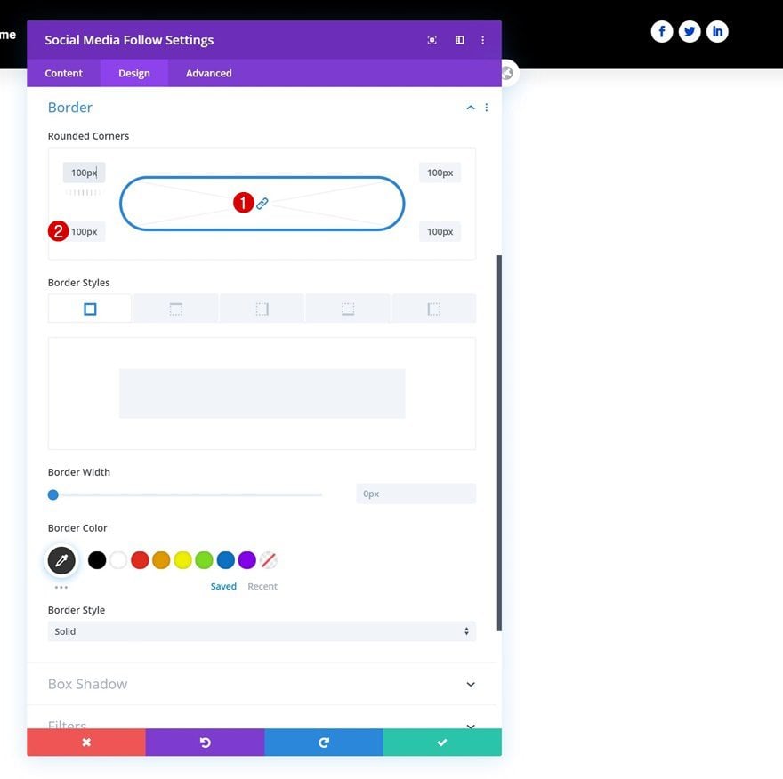
Border
And complete the module settings by adding some border radius.
Add Row Header #2
Column Structure
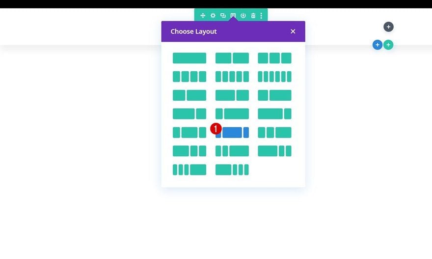
On to the second header! Add a new row using the following column structure:
Sizing
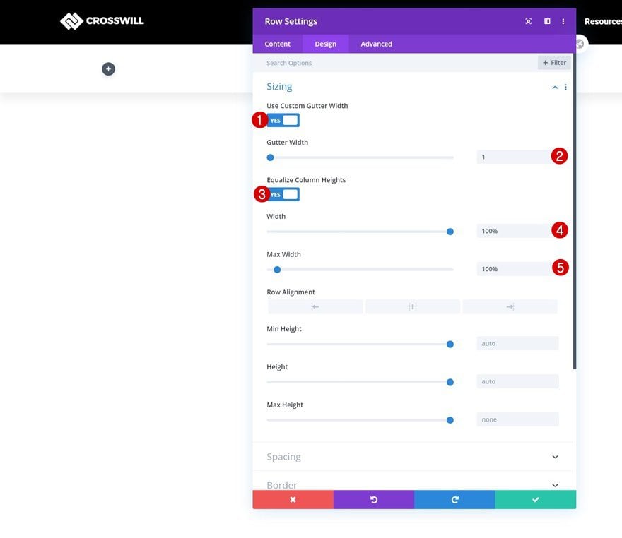
Without adding any modules yet, open the row settings and change the sizing settings as follows:
- Use Custom Gutter Width: Yes
- Gutter Width: 1
- Equalize Column Heights: Yes
- Width: 100%
- Max Width: 100%
Spacing
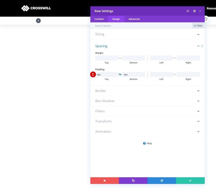
Remove all default top and bottom padding next.
- Top Padding: 0px
- Bottom Padding: 0px
Main Element
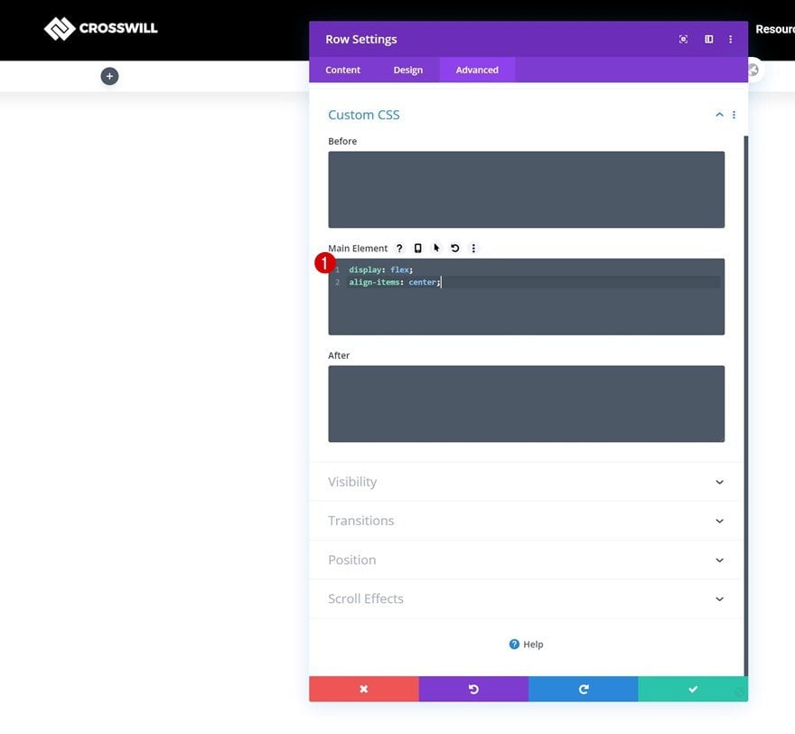
Then, align all column content by using two lines of CSS code in the row’s main element.
display: flex;
align-items: center;
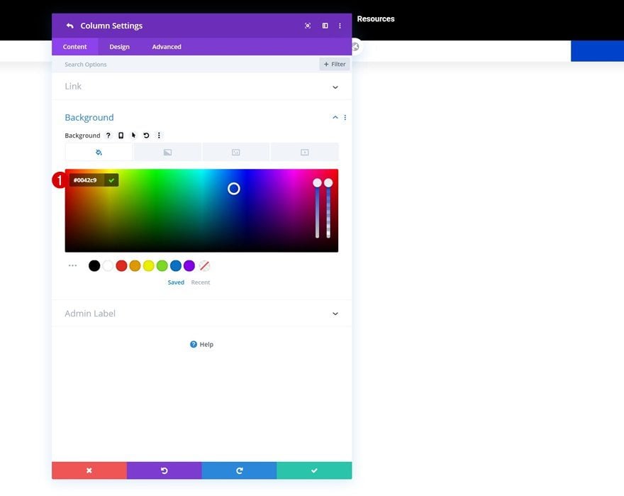
Column 3 Background Color
And complete the row settings by opening the column 3 settings and using a background color.
- Background Color: #0042c9
Add Image Module to Column 1
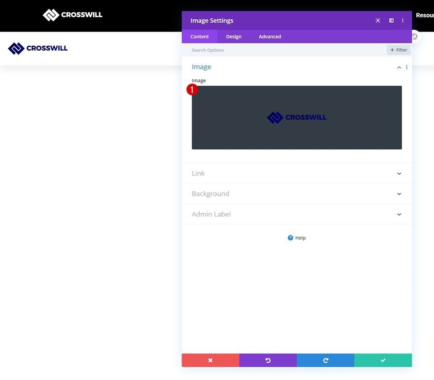
Upload Image
In column 1, the only module we need is an Image Module. Upload a logo of your choice.
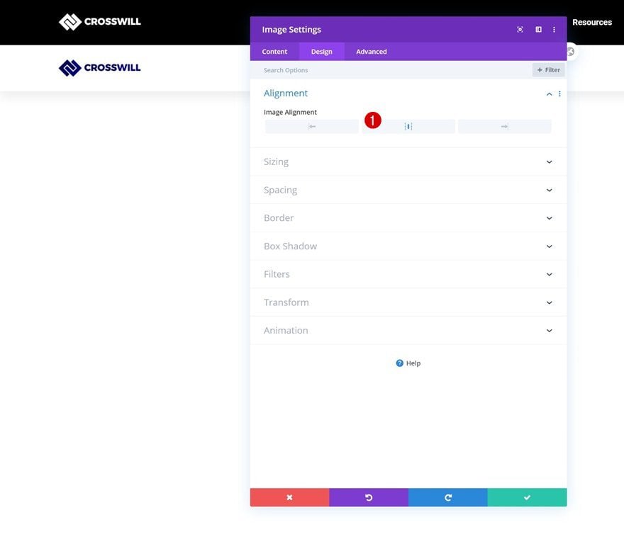
Alignment
Change the module’s image alignment next.
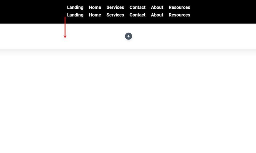
Clone Menu Module & Place in Column 2 of Row Header #2
Clone the Menu Module that was used in the previous row and place the duplicate in the second row’s middle column.
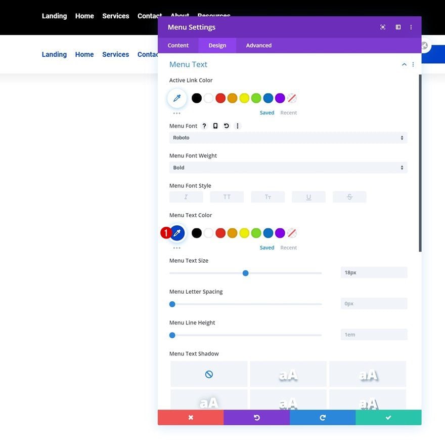
Modify Menu Text Settings
Open the duplicate Menu Module and change the menu text color.
Modify Dropdown Menu Text Settings
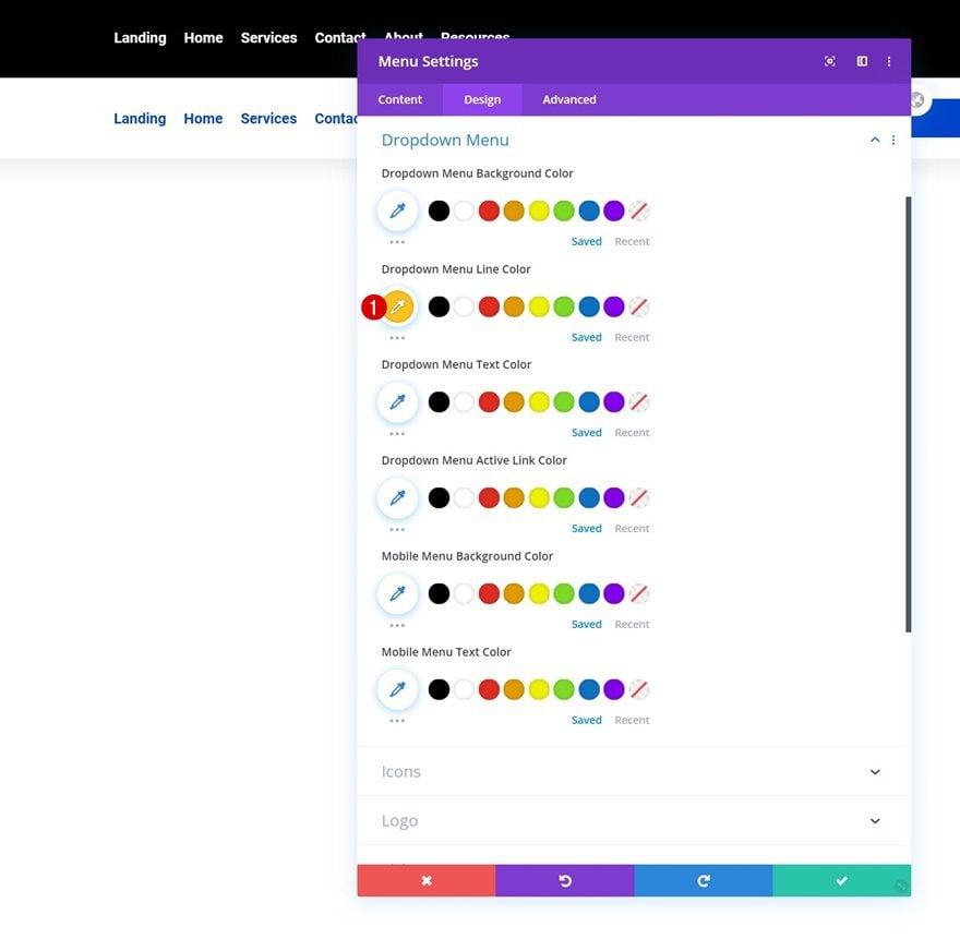
Modify the dropdown menu text settings too.
- Dropdown Menu Line Color: #ffc21d
Modify Icon Settings
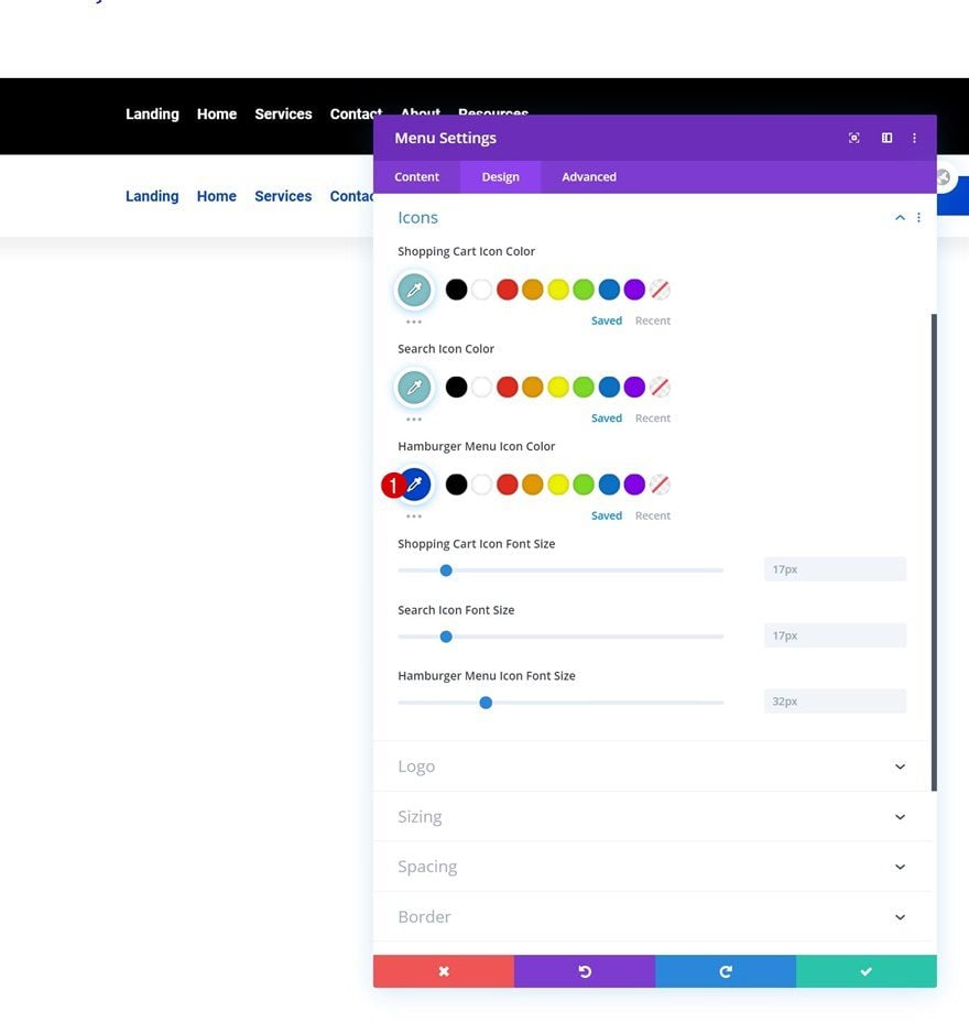
Complete the Menu Module settings by changing the hamburger menu icon color.
- Hamburger Menu Icon Color: #0042c9
Add Button Module to Column 3
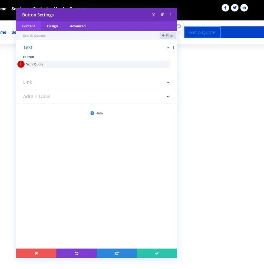
Add Copy
In the row’s last column, the only module we need is a Button Module. Enter some copy of your choice.
Alignment
Modify the button alignment next.
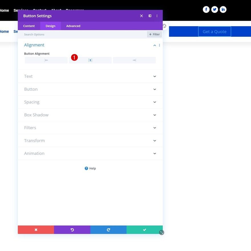
Button Settings
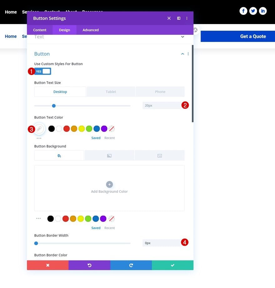
Then, style the button as follows:
- Use Custom Styles For Button: Yes
- Button Text Size: 20px (Desktop), 18px (Tablet), 15px (Phone)
- Button Text Color: #ffffff
- Button Border Width: 0px
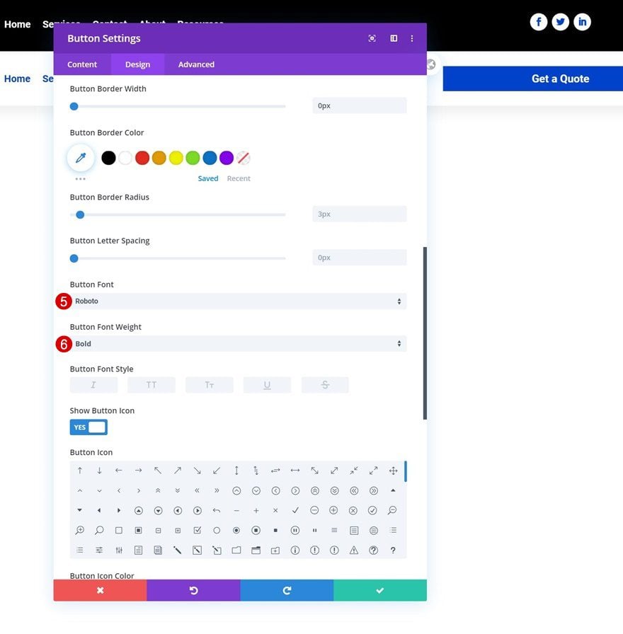
- Button Font: Roboto
- Button Font Weight: Bold
Spacing
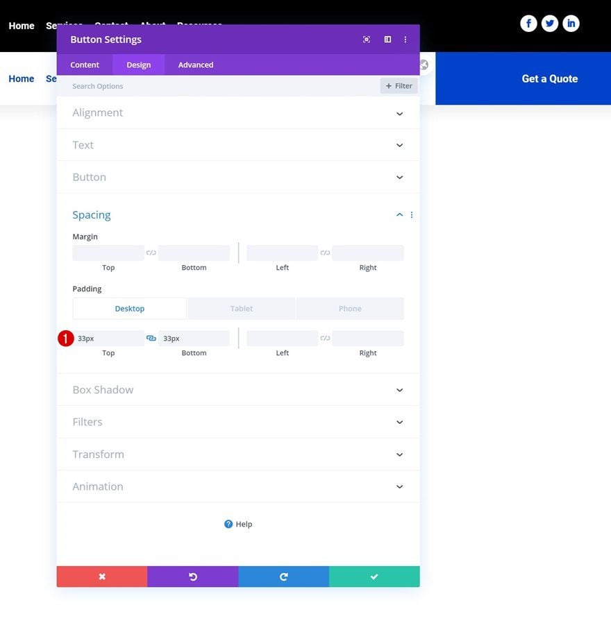
And complete the module settings by adding some custom padding across different screen sizes.
- Top Padding: 33px (Desktop), 35px (Tablet), 38px (Phone)
- Bottom Padding: 33px (Desktop), 35px (Tablet), 38px (Phone)
2. Add CSS Classes
Section
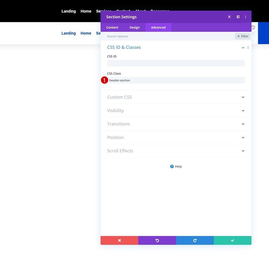
Once you’ve added and styled all modules, it’s time to add the CSS classes which we’ll use inside our JQuery code. First, open the section settings and use the following CSS class:
- CSS Class: header-section
Row Header #1
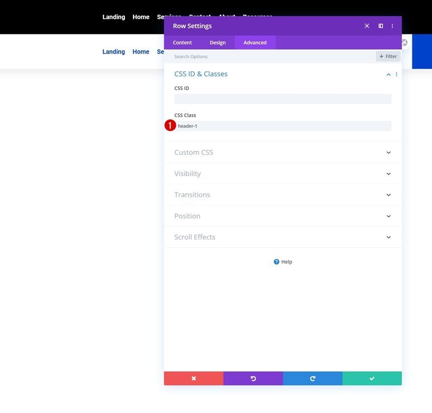
Then, open the first row header and use the following CSS class:
Row Header #2
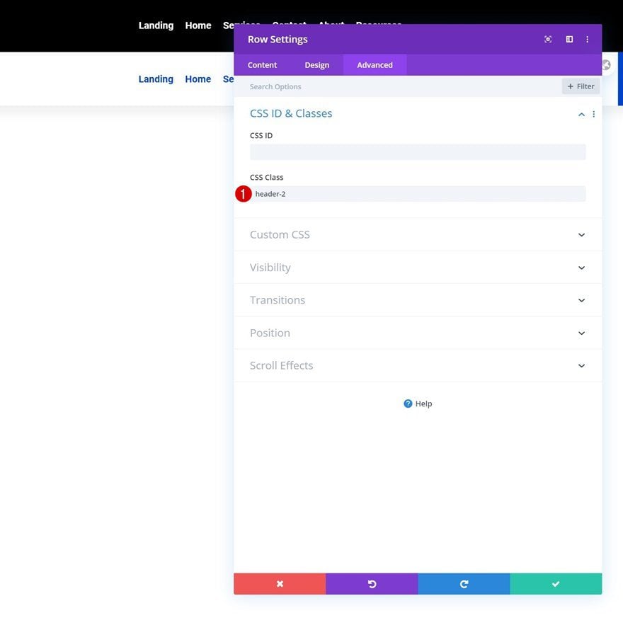
Open the second row as well. Use the following CSS class for it:
3. Add JQuery & CSS Code
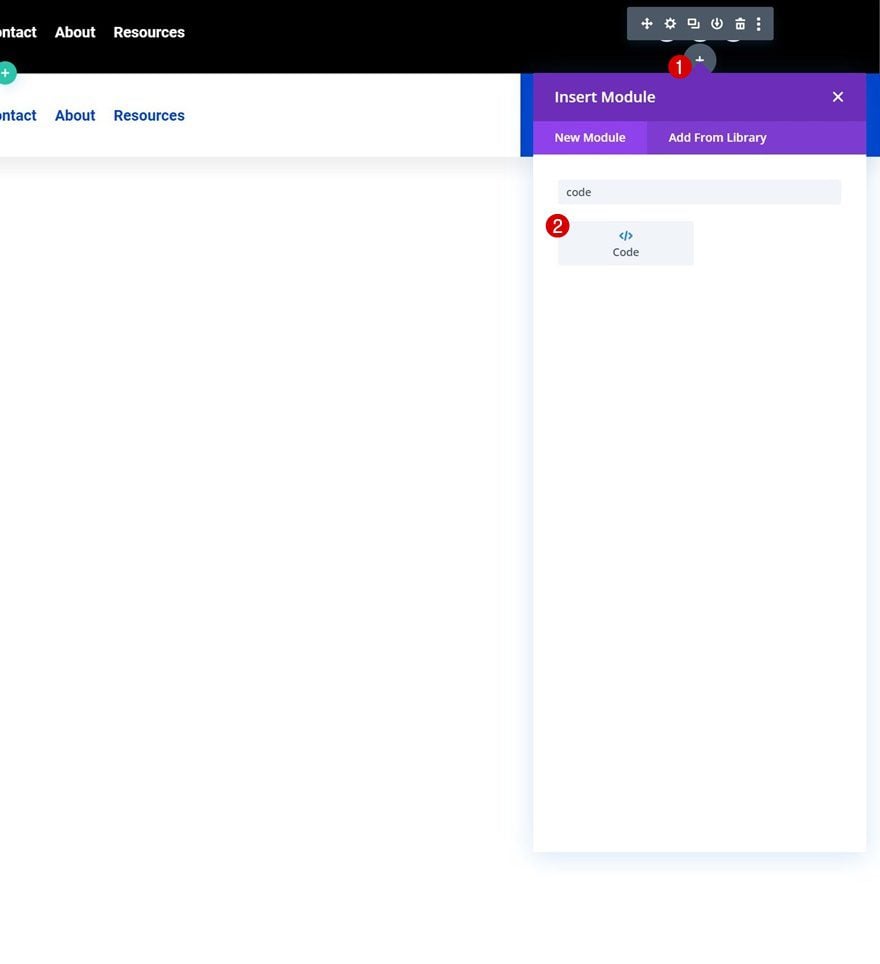
Add Code Module to First Row’s Third Column
Once all CSS classes are in place, it’s time to add the code. Add a new Code Module wherever you want inside your section. We’re placing it in the first row’s third column.
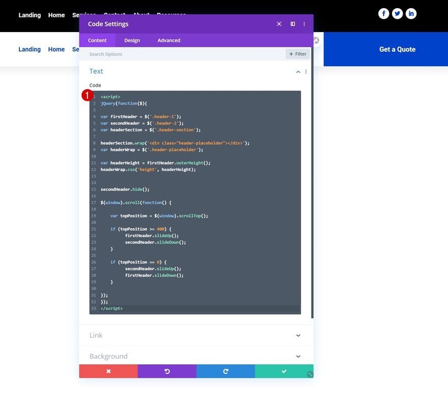
Add JQuery Code (Between Script Tags)
Then, add the following lines of CSS code between script tags as you can see in the print screen below:
jQuery(function($){

var firstHeader = $('.header-1');
var secondHeader = $('.header-2');
var headerSection = $('.header-section');

headerSection.wrap('<div class="header-placeholder"></div>');
var headerWrap = $('.header-placeholder');

var headerHeight = firstHeader.outerHeight();
headerWrap.css('height', headerHeight);


secondHeader.hide();

$(window).scroll(function() {

    var topPosition = $(window).scrollTop();

    if (topPosition >= 400) {
          firstHeader.slideUp();
          secondHeader.slideDown();
    }

    if (topPosition == 0) {
          secondHeader.slideUp();
          firstHeader.slideDown();
    }

});
});
Add CSS Code (Between Style Tags)
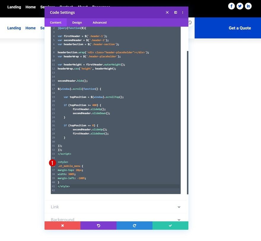
Add the following CSS code between style tags as well:
.et_mobile_menu {
margin-top: 20px;
width: 300%;
margin-left: -100%;
}
4. Save Theme Builder Changes & View Outcome
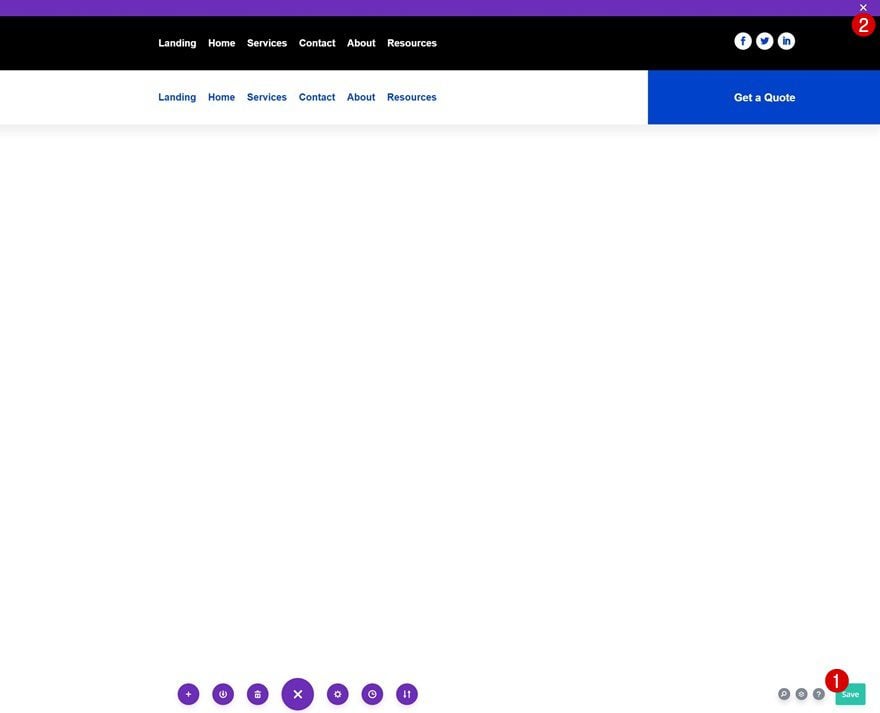
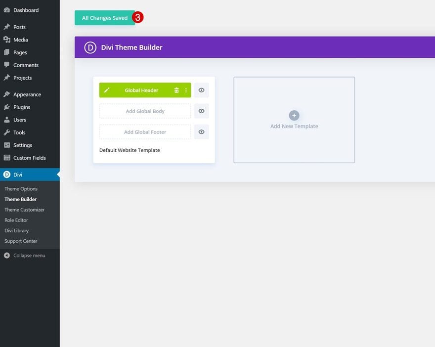
At this point, the only thing left to do is save all theme builder changes and view the outcome on your website!
Preview
Now that we’ve gone through all the steps, let’s take a final look at the outcome across different screen sizes.
Desktop
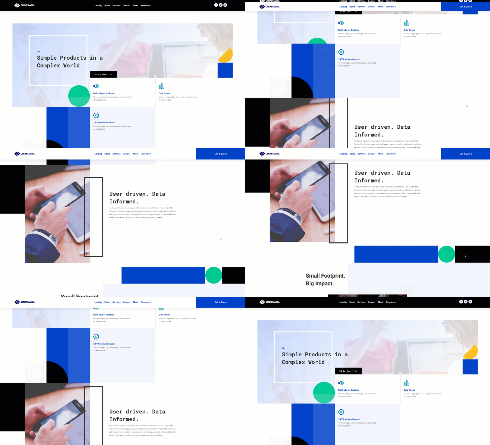
Mobile

Final Thoughts
In this post, we’ve shown you how to swap your Divi header for another one on scroll using Divi’s theme builder, the Divi elements and some additional JQuery and CSS code. We’ve also auto-generated some space at the top of the page container that prevents the fixed header from overlapping the page content. You were able to download the swap Divi header template JSON file for free as well! If you have any questions or suggestions, feel free to leave a comment in the comment section below.
If you’re eager to learn more about Divi and get more Divi freebies, make sure you subscribe to our email newsletter and YouTube channel so you’ll always be one of the first people to know and get benefits from this free content.
Keep reading the article at Elegant Themes Blog. The article was originally written by Donjete Vuniqi on 2020-03-12 12:00:57.
The article was hand-picked and curated for you by the Editorial Team of WP Archives.

