Top Web Design Trends for February

Top Web Design Trends for February 2022

Written by

Carrie Cousins
on

February 25, 2022

Last Updated on February 25, 2022

Now that we are well into 2022, it’s time to start thinking about modern refreshes and website design trends. Whether you are starting new or just looking for a few trending touches, we’ve got some great ideas to help you along the way. 

Here are five great trends that will keep your WordPress website looking fresh. 

1. Big, Big Text

The more we look at typography trends, the more we keep coming back to the concept of big text elements. And they just keep getting even bigger. 

Designers are having a lot of fun with oversized text that’s fully integrated into the design, such as the text on the photo here at regrocery.co. 

For the most part, this concept is used with bold images and text elements that include short words.

  • Why it works: This design works when text and image elements work together. When paired in a way that feels united and seamless, the result can be stunning and highly engaging.
  • How to use it: This is one of those trends where you can’t force it. You need just the right words – shorter is often best – and a stellar image that combine to create a unified message. If the elements work against each other, the design won’t hold up. 

2. Hidden Navigation

This is one of those trends that seems to be almost everywhere, it seems completely counter-intuitive: The navigation is hidden. 
Top Web Design Trends for February 2022 1

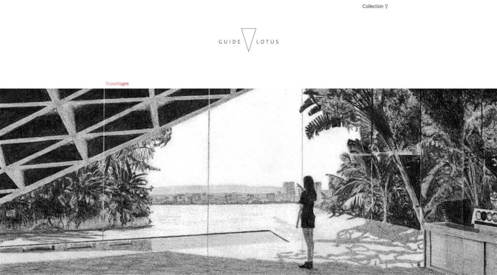
Without an obvious menu or navigation structure at guidelotus.com, designers are opting for deeper headers with more white space – reminiscent of many mobile homepages – and kicking navigation elements out of the design. 

The result is a very clean and sleek visual, but is it user-friendly? This is something you’ll have to test on your website. If you go this route focus groups, user testing, and a close look at analytics to ensure usability are important. 

  • Why it works: Users are getting more and more accustomed to hidden and hamburger-style navigation because of the increased usage of mobile sites. Because mobile websites have been using these patterns for a while, they are almost becoming the norm anywhere. 
  • How to use it: Start with a small site. If the user can get everything they need by scrolling, navigation won’t be missed as much. Make sure to provide plenty of other visual clues to help guide the journey. 

3. Child-like Fun

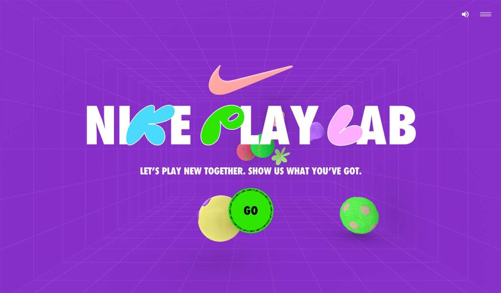
Bold color, animation, and funky fonts all contribute to a more fun, child-like experience in this website design trend. With the weight of the world in the past few years, this lighter feel is a welcome option. 
Top Web Design Trends for February 2022 2

Designers are going all-in with a fully child-like theme too, just like at nikeplaylab.com. Often with a design trend like this, you see bold color or animation or funky fonts, but now we are seeing all three quite often.

There’s another element at play here as well. These “childlike” elements are also throwbacks to the 1980s and 1990s, those generations now have kids of their own. There’s an almost nostalgia that comes with this trend as it combines a childlike feel that reminds adults of their own childhoods with visual elements. 

  • Why it works: This trend plays on emotion and happy memories. Those elements combine to make website users feel comfortable and at home. If a website makes you feel good, you’ll keep coming back, right?
  • How to use it: This visual scheme needs the right content to work. Make sure that the words match the tone of the visual display. You don’t want to sell tax preparation on a website with a child-like feel. Content and design symmetry matters a lot here. 

4. Mismatched Color Schemes

In design theory, the color wheel helps guide choices. We look for harmonies and combinations that will appeal to wide audiences and make a design just feel right. 
Top Web Design Trends for February 2022 3

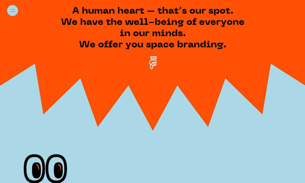
Right now, designers are throwing that concept out the door with bold color schemes that use seemingly mismatched color combinations, like at studiobardzo.com. This includes everything from colors that you would never imagine pairing to things like a bright paired with a pastel. 

Admittedly, it can be a little garish. But it can also work with the right content. This color trend almost plays off of the same emotions and vibes as working with child-like design aesthetics. 

  • Why it works: Colors that don’t seem to go together are a bit disruptive and make you look. Anything that gets in the way of the normal flow can cause you to pause and investigate; that’s exactly what designs using this color trend aim to do. 
  • How to use it: Pick your colors carefully and don’t be afraid of them. If you are going for a mismatched color combination, it is innately daring. Use it in that manner in the design. The example here uses two colors that fill the screen as it leans into this design trend. 

5. “Magazine” Grids

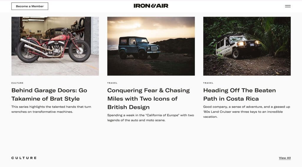
When you have a blog or a lot of content that you want to showcase, a “magazine” style grid is a clean way to organize and highlight content. A magazine-style is often exemplified by a large hero image with columns of additional content blocks below. Those columns might include just one row of content to infinite scrolling rows.
Top Web Design Trends for February 2022 4

The trick to this website design trend, like at ironandair.com is all in the structure of content organization. You need a strong grid.

In the example here, you can see that every new content element has a distinct set of elements that line up perfectly. There’s no question about where to look or what to read or how the eye should flow. The structure of the grid takes all the work out of it for you, making it easy for the user to engage. 

  • Why it works: When you don’t have to think about a design, it is easy to engage with. The more content and information you have to display, the more important this becomes. 
  • How to use it: This design aesthetic is made for blogs or sites with a lot of content that’s updated regularly. 

Putting it All Together

Website design trends are a fun way to keep a finger on what visual elements people are paying attention to. Remember that it can be just as important to see what stops trending as what is so that your projects don’t begin to look dated. 

Need a better set of page-building tools to give you more web design power? Check out Kadence Blocks!

Carrie Cousins

Carrie Cousins has more than 15 years of experience in media, design, and content marketing. She works in digital marketing and is also a freelance writer and designer, specializing in creating amazing experiences online for small businesses. Her work has been featured in publications such as Design Shack, Webdesigner Depot, The Next Web, and Fast Company. She’s an avid runner, which comes in handy with Australian shepherds at home.
Top Web Design Trends for February 2022 5

Keep reading the article at WordPress News | iThemes Blog. The article was originally written by Carrie Cousins on 2022-02-25 12:22:53.

The article was hand-picked and curated for you by the Editorial Team of WP Archives.

Disclosure: Some of the links in this post are "affiliate links." This means if you click on the link and purchase the product, We may receive an affiliate commission.

Leave a Comment

Your email address will not be published. Required fields are marked *

Top 5 Web Design Trends of May

Top 5 Web Design Trends of May 2022

Written by

Carrie Cousins
on

May 31, 2022

Last Updated on May 31, 2022

The things we are trying this month, according to website design trends, all involve calls to action. Every one of these trends helps create a path for users to do something on your website. Some just happen to be more obvious than others.

Here are five great trends to consider this month:

1. Novelty Typefaces

Novelty typefaces are one of those design trends that can be a lot of fun. You know these typefaces because you can’t really identify them easily by name or style and they often are things you probably haven’t seen elsewhere. Just check out this example from Future Goals.

Novelty typefaces are often used for display or short text blocks – such as the headline in the main hero area and include words to inspire action or interaction with the design.

  • Why it works: This kind of type treatment works because it gets your attention. These styles are interesting and should help tell the story on the website that much better.
  • How to use it: These typefaces are to be used sparingly. Find one key element that can benefit from this design trend and don’t use it anywhere else.

2. Extraordinary Imagery

Top 5 Web Design Trends of May 2022 6

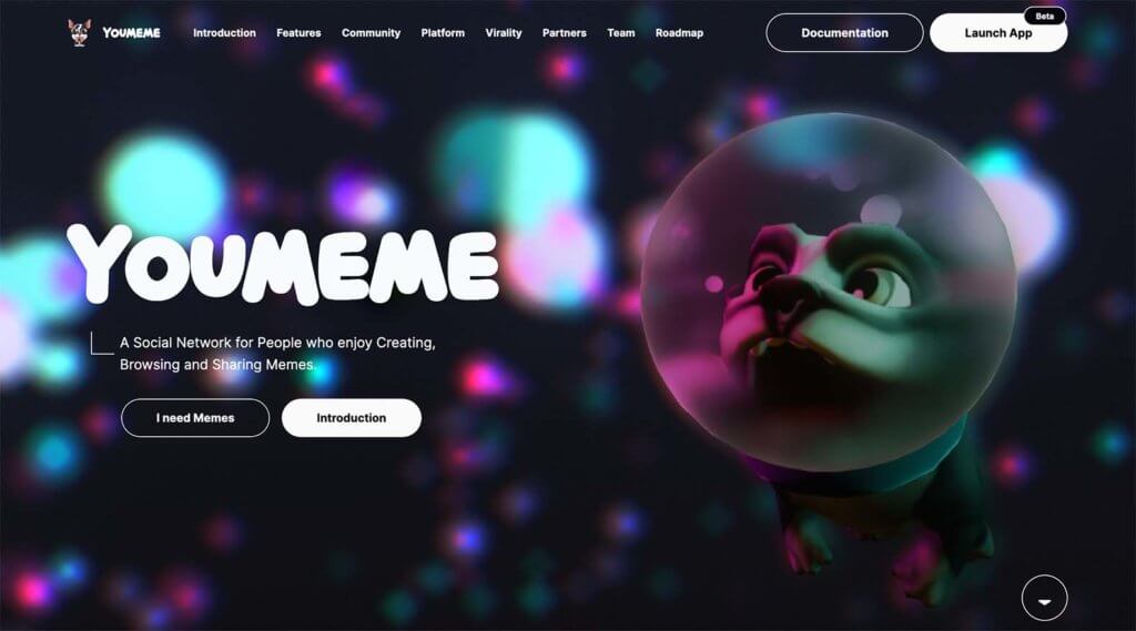
Larger-than-life images that border on extraordinary or AI-inspired are the basis for quite a few website homepages right now. This type of imagery serves a specific purpose to draw in website visitors to the content. See this in action at YouMeme.

The thing that’s cool about this website design trend is it can work for almost anything – even things you might not expect. An image element that’s oversized, colored in an unexpected way, or combined with something unusual – such as merging photos and illustrations – are all common here.

  • Why it works: Again, the key contributor to why it works is attention. Big, bold imagery or video elements will make users stop and look. That’s the first step to getting someone to do something on your website.
  • How to use it: Connect an extraordinary bit of imagery to your content. Then add this element to a large section of the website, such as the header for maximum impact.

3. Popups with Purpose

Top 5 Web Design Trends of May 2022 7

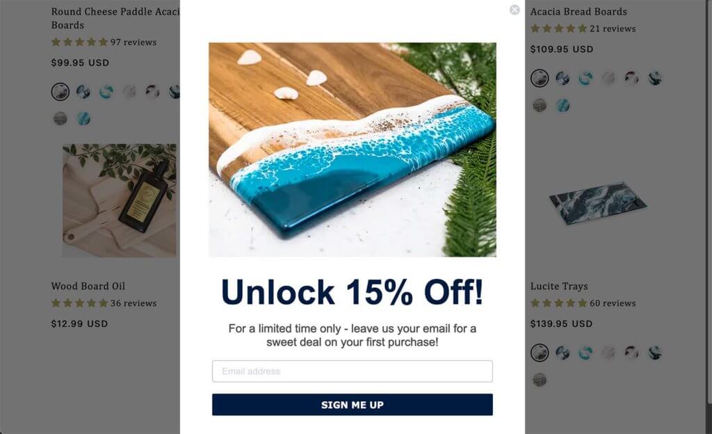
Popups can be a real hit-or-miss opportunity on your website. The reason you see so many of them is because they can work and generate sales, clicks, and email signups. Check out this example from Lynn & Liana.

For a popup to really work, it has to provide something valuable for the user when they want it. This can be an offer, opportunity, or information. Just remember, a popup should only appear if it has a distinct purpose.

  • Why it works: Popups are a planned disruptor in the website journey. When done well, they get in the users’ way at the right time to help facilitate action.
  • How to use it: Listen to the Kadence Beat podcast for tips on how to effectively use popups as part of the customer journey.

4. Oversized CTA

Top 5 Web Design Trends of May 2022 8

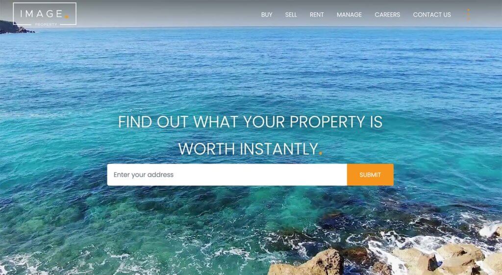
Want to get a website visitor’s attention and inspire action? Make this element a focus of the design as in this example from Image Property. While calls to action are often tucked into buttons or email submission forms such as the one in this example are tucked into the footer, this trend puts those elements out in the open.

It creates an obvious click path for users so that they don’t have to think about what to do next. The interactive cue is huge and ready to use.

  • Why it works: There’s no conflict or question about what to do with the design. You have told users what you want them to do visually.
  • How to use it: This technique is for simple and direct CTAs. This email signup works, as does a search bar, video play, or another element that is rooted in a single interaction.

5. Almost Brutalism

Top 5 Web Design Trends of May 2022 9

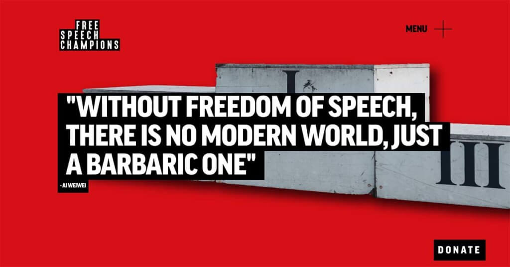
Almost brutalism is a design trend that has evolved from the brutalist designs of the past. While these websites are still somewhat harsh and bold visually, they are considerably softer than the previous iteration of brutalism. Just check out this example from Free Speech Champions.

This trend uses bold colors, big text, simple typefaces, and lots of lines. You won’t see a lot of images or light typography.

  • Why it works: The design is simple and direct with a clear path for users to follow.
  • How to use it: This design trend works with just the right content. It’s best for sites that are simple and have limited options for users so that they don’t get lost in the harshness of the design. This can be a lot for some people to digest.

Putting it All Together

WordPress website design trends are a fun element that can keep your site looking fresh and modern. But don’t feel like you have to try every new trend that comes along. Pick the ones that are right for your website and brand to ensure that your design feels trendy but still like you.

Get the bonus content: Web Design Terms You Should Know

Carrie Cousins

Carrie Cousins has more than 15 years of experience in media, design, and content marketing. She works in digital marketing and is also a freelance writer and designer, specializing in creating amazing experiences online for small businesses. Her work has been featured in publications such as Design Shack, Webdesigner Depot, The Next Web, and Fast Company. She’s an avid runner, which comes in handy with Australian shepherds at home.

nttnttttnnttttntttnttt”,

“redirect_after_formfill_enabled” : 0,
“redirect_after_formfill_url” : “”,

“exit_popup_enabled”: 0
};

Keep reading the article at WordPress News | iThemes Blog. The article was originally written by Carrie Cousins on 2022-05-31 10:52:49.

The article was hand-picked and curated for you by the Editorial Team of WP Archives.

Disclosure: Some of the links in this post are "affiliate links." This means if you click on the link and purchase the product, We may receive an affiliate commission.

Leave a Comment

Your email address will not be published. Required fields are marked *

Show Your ❤️ Love! Like Us
Scroll to Top