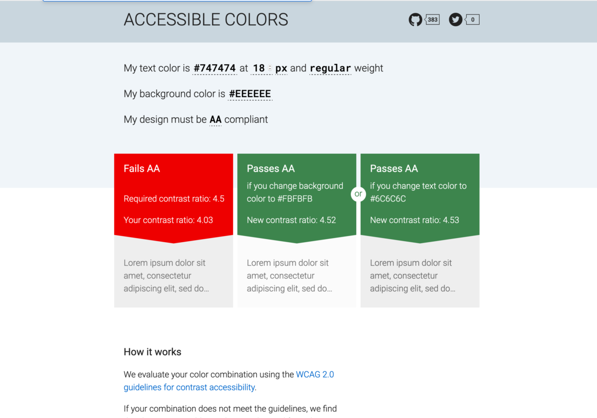
At a recent (virtual) Fort Collins WordPress meetup, someone shared this little site which I’ve never encountered before: Accessible-Colors.com. As you might guess from the name, it’s a simple little site/tool to tell you if the contrast between two colors you’re using in a design is in line with the WCAG 2.0 standard for contrast.
If you color’s don’t quite work, it’ll give you a way to make them work by modifying one or the other of them. In that way, it’s just flexible enough. It doesn’t do more than two colors, and it doesn’t give more than two recommendations. But that’s really all I think it needs to.
I’m sure there are lots of other ways to tell if colors conform to WCAG standards, but I love how simple and quick this one is. Definitely worth a bookmark ?
Visit accessible-colors.com →
Keep reading the article at WPShout. The article was originally written by David Hayes on 2021-04-07 14:21:35.
The article was hand-picked and curated for you by the Editorial Team of WP Archives.

