In online marketing, every advertising or marketing campaign has an objective. No one throws money on the web without expectations.
Whether it’s a free or paid campaign, every marketer is trying to drive traffic to a specific page on their website. That specific page is called a landing page.
Basically, if you are running any marketing promotion aimed at driving traffic to your website, the page on your website that appears in response to clicking on your campaigns is the landing page.
In my years of working online and helping bloggers and businesses in inbound marketing, I have seen big improvements with simple tweaks applied to existing campaign destination pages. The problem generally is not with the quantity and/or quality of traffic.
Many advertisers have seen their efforts be punctured and wasted by elements that appear right there on their landing pages. I’m sure that by the time you are done implementing some of the suggestions in this post, you are going to see some exciting changes in your results.
How do you create a landing page?
In the early days of internet marketing, creating a simple squeeze page was a considerable task. You needed someone with HTML and CSS or even JavaScript skills to build your pages. While this was more costly, you also needed to wait for days to have your pages delivered.
But a lot has changed in recent times. Most Content Management Systems (CMS) and email service providers are built with facilities to allow you to easily create your own landing pages. You might want to consider using a free landing page builder if your CMS doesn’t give you an easy option.
Let’s now look at the do’s and don’ts of conversion-driven landing pages.
13 do’s and don’ts of conversion-driven landing pages
These are some fundamental do’s and don’ts that will help improve the performance and conversion rate of your landing pages.
1. Don’t: Use distractions
When you drive traffic to your landing page, you want visitors to carry out just one task. One main characteristic of a good landing page is that it has got just one goal with a single Call-To-Action (CTA). Other elements on the page that might constitute a distraction should be taken down.

Avoid linking out, menus, pop-ups, advertisements, and every form of unnecessary addition that will take the reader’s attention away from the main focus.
2. Don’t: Ask for too much
There are different types of landing pages. If your page requires data from visitors through web forms, avoid asking for too much. The more fields there are to fill out, the more people will drop out.
I would recommend you collect the most basic information that will allow you to interact with the lead for more information. Generally, first name and email should be a good start. Once you have them on board, you may go ahead and require more information: phone numbers, town, zip code, etc.
3. Don’t: Use boring and long text or videos
Go straight to the point and help your visitor discover the message. Long and boring content will put many of your readers off.
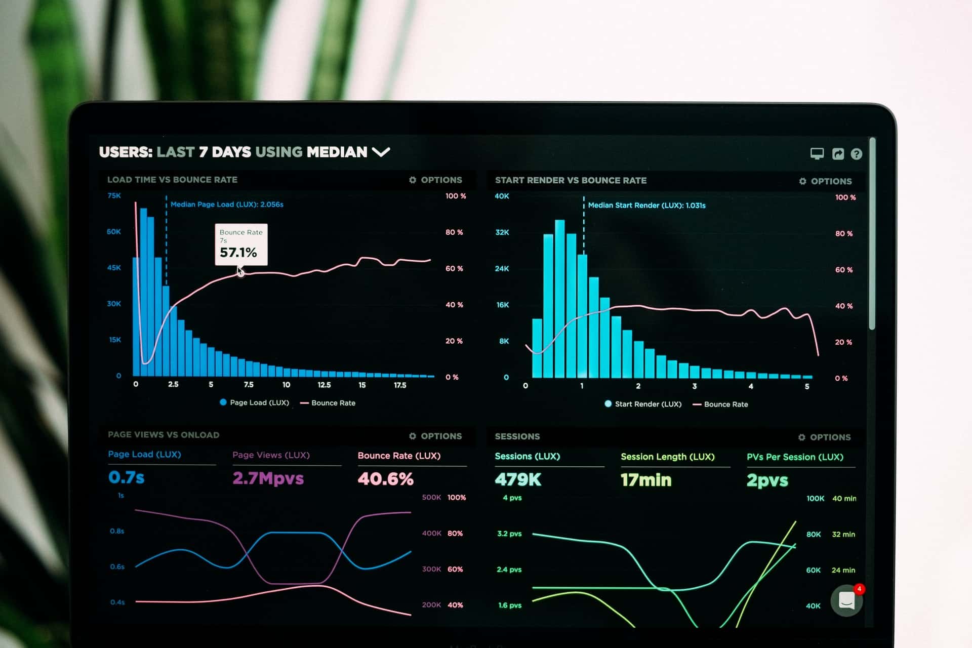
4. Don’t: Have a slow loading time
If your landing page takes over one second to load, then there is a problem. You have to optimize it to drop the load speed to under a second.

The more time it takes, the more chance you stand to lose potential leads.
5. Don’t: Make fake and unrealistic promises
One of the worst mistakes you will ever make that completely ruin your business in the near future is using fake promises. I have seen untutored marketers use this tactic just to get visitors to submit their email addresses. Once your subscribers find out you are fake and unreal, you will witness a massive unsubscription or refund rate, bad reviews, and terrible customer feedback. That will end up damaging your overall performance.
6. Do: Focus on one goal
I have seen some landing pages with several different products being promoted at once. I personally think this is a serious distraction and a factor that reduces conversions. Each landing page should be focused on a single goal that is highlighted in the advertising campaign.
7. Do: Use a strong call to action
A call to action is an element on the page that provokes the reader to take the required action. This can be in the form of highlighted text, image, or form button designed to stand out.
8. Do: Use social proof
Social proof is a strong marketing element. It includes testimonials, social shares, likes, comments, followers, reviews, etc.

Social proof shows how much your personality or your product is accepted and appreciated by the market. Adding some elements of social proof on your landing page may take your conversions a step ahead. You should, however, avoid faking your social proof.
9. Do: Use a compelling title
The title or heading of your landing page plays a huge role in keeping your visitors on the page. While I recommend you make it compelling and catchy, it should not be misleading. Your page heading should complement your campaign text and message.
10. Do: Optimize for mobile
If by any means you are paying a designer to design your landing page, emphasis should be laid on it being mobile friendly. This makes sure the page perfectly fits on the screen of any mobile device.

As a greater portion of your traffic comes from mobile users, a mobile-friendly page will expose you to a larger audience.
11. Do: Use a clear value proposition
As there is a lot of competition out there, make sure you have something that stands out. Before someone clicks on your CTA, they need a clear answer to the question, “What will I get by clicking this button?”. If you offer something they won’t get elsewhere, you’ll get them to take the right action.
12. Do: Test and test
Test different elements on your landing page to see what works best, beginning with the headline, images, videos, text, button text, colors, etc. You may need different versions of pages tested through an A/B split testing tool to come up with the best possible option.
13. Do: Consider overall page design
There are many other design elements you must consider. These include fonts, colors, image quality, page background, line spacing, etc.

While many of the page designers out there have made it easy to generate pages with these elements taken care of, you must make sure any changes you make do not distort the wellness of the page.
Conclusion
Thank you for reading through to this point. I hope some or all of these points will help you kick your landing page conversion rate through the roof. Good luck as you carry out some changes for improved results.
![]()
![]() Latest posts by Editorial Staff (see all)
Latest posts by Editorial Staff (see all)
Where Should We Send
Your WordPress Deals & Discounts?
Subscribe to Our Newsletter and Get Your First Deal Delivered Instant to Your Email Inbox.
Thank you for subscribing.
Something went wrong.
Keep reading the article at WP Newsify. The article was originally written by Editorial Staff on 2021-04-21 13:41:56.
The article was hand-picked and curated for you by the Editorial Team of WP Archives.

