A
re you looking to build the best Contact Us page possible on your website?
A contact page might seem simple enough on the surface, but there are actually a lot of important factors to consider before you create your own!
The perfect contact us page will help you…
- Get more – and BETTER – leads
- Reduce spam in your inbox
- Save time on back-and-forth emails
- Cut down on irrelevant sales pitches
Looking for the best contact us page examples for inspiration?
Whether you’re just starting a blog for the first time or have had a website for a while, it’s never too late to create the perfect contact page.
We’ll jump right into those contact page examples, but if you want to skip ahead to tips and best practices you can use this table of contents:
Let’s begin!
The 10 Best Contact Us Pages on the Web
Sometimes, just by examining a good Contact Us page, you can get some inspiration to tweak your own, so you can increase conversions or prevent losing a potential client.
So let’s take a look at 10 of the best Contact Us pages from around the web.
1. Grammarly
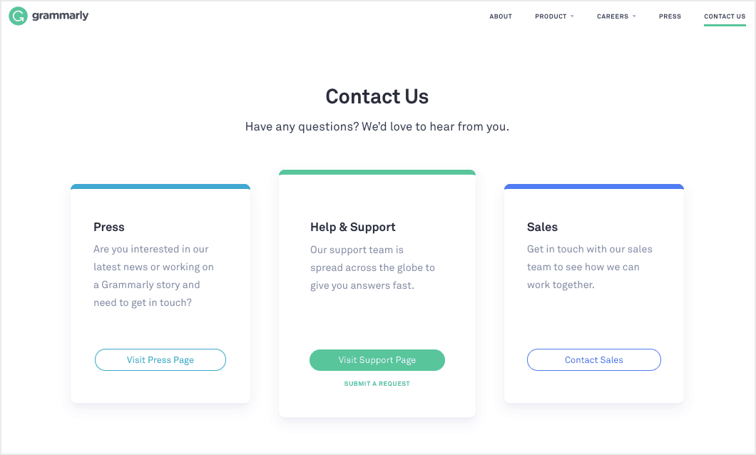
The Grammarly Contact page is at the top of our list of best contact us pages because it’s clean and uncluttered and makes it obvious you have 3 options to choose from: Press, Support or Sales.
- Press takes you to a selection of press and media releases that may address your inquiry. If not, there’s a specific press email address to contact.
- The Support option directs you to the support portal where you can search for answers in the knowledgebase, contact specific teams like Accounts and Billing, or go to a general contact us page.
- Clicking Sales leads you to a new page where you have to complete a contact us form:
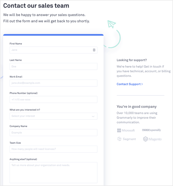
Overall, everything is easy-to-follow and the page design matches the company branding.
2. Moz
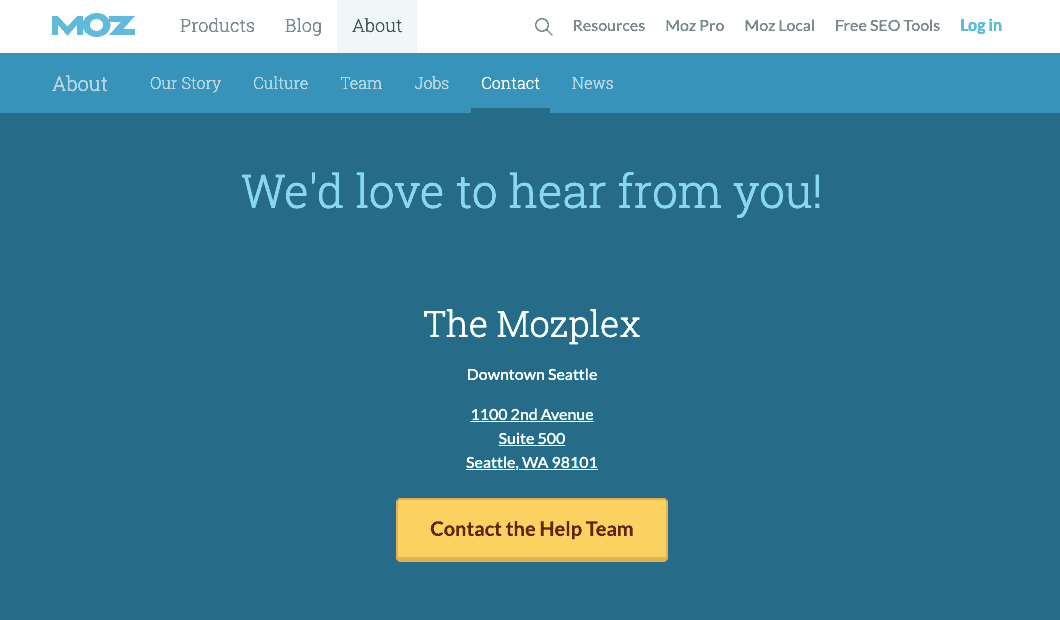
The Moz Contact Page starts as a submenu item of the About page. But their message is clear: “We’d love to hear from you!”
Following that warm welcome is their physical office address (there’s a map at the bottom of the page too) and then a button to click if you want to contact the company help team.
Clicking the button takes you to the contact help form, which includes a dropdown selection on the first field so your inquiry can be directed to the correct team.
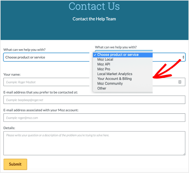
After that, there are a couple of email address fields to complete, one that you prefer to be contacted at and one that’s associated with your Moz account. And finally, there’s a field to enter the details of your request before pressing the Submit button.
3. WPForms
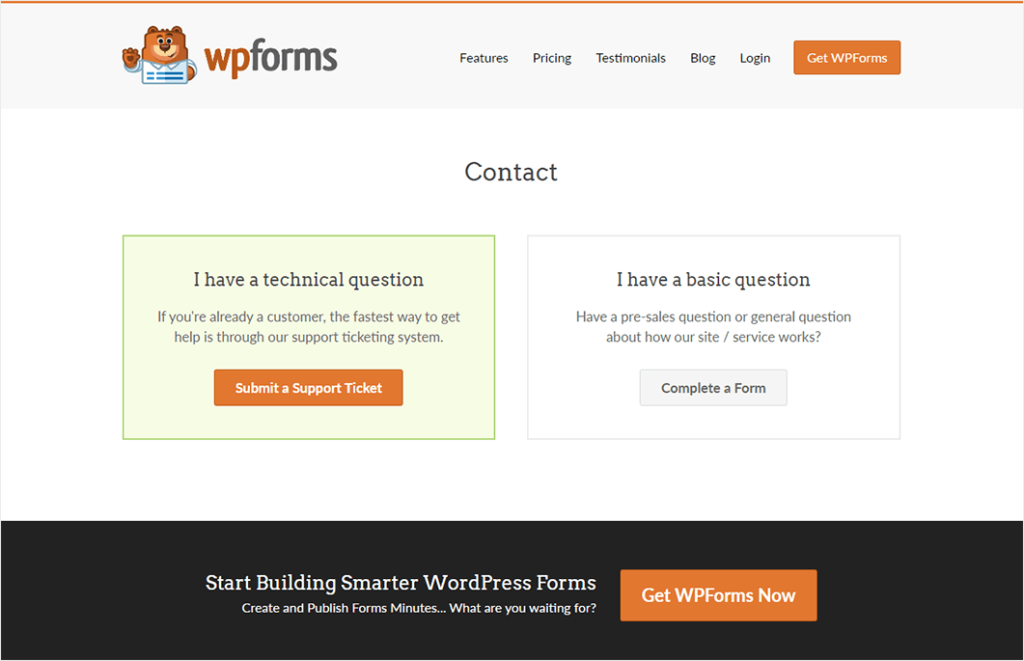
WPForms makes our list of the best contact us pages because it’s so helpful to visitors. This Contact Page presents you with 2 options: Technical questions or Basic questions.
The Technical question route takes you to the support documentation where you can search for an answer. If you can’t find what you’re looking for, then there’s a simple form to complete:
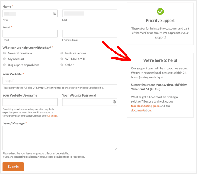
The form includes options so you can select the correct team for your inquiry, such as Bug report and Feature request. And on the right-hand side of the page is some guidance on customer service hours and when to expect a response.
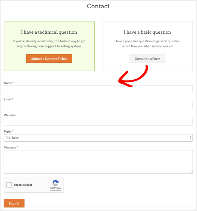
Clicking the Basic question opens a simple contact us form below where you can ask a pre-sales question or make a general inquiry:
4. Gill Andrews
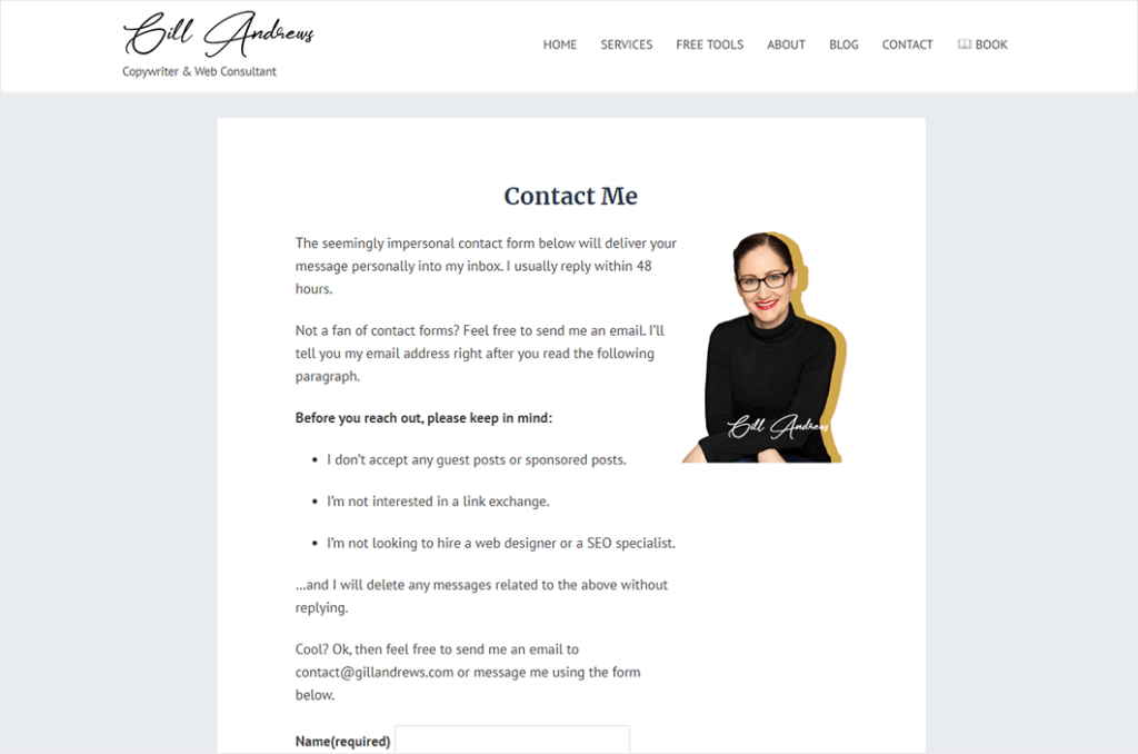
Web consultant Gill Andrews starts her Contact Page with a slightly tongue-in-cheek message that informs website visitors they can either use the contact form or email her:
It’s a catch-all for those that don’t like using forms. And it states quite clearly that she usually replies within 48 hours so visitors know what to expect.
Then there’s a note about what she’s not interested in hearing about, like guest posts and link exchanges!
If you find yourself too many messages you don’t want or need, it may be worth doing something similar. Although you can’t stop visitors from submitting inquiries, you can at least tell them what you won’t reply to.
For example, while some blogs are happy to receive guest posts, others aren’t, so you can make it clear what your position is.
5. John Espirian
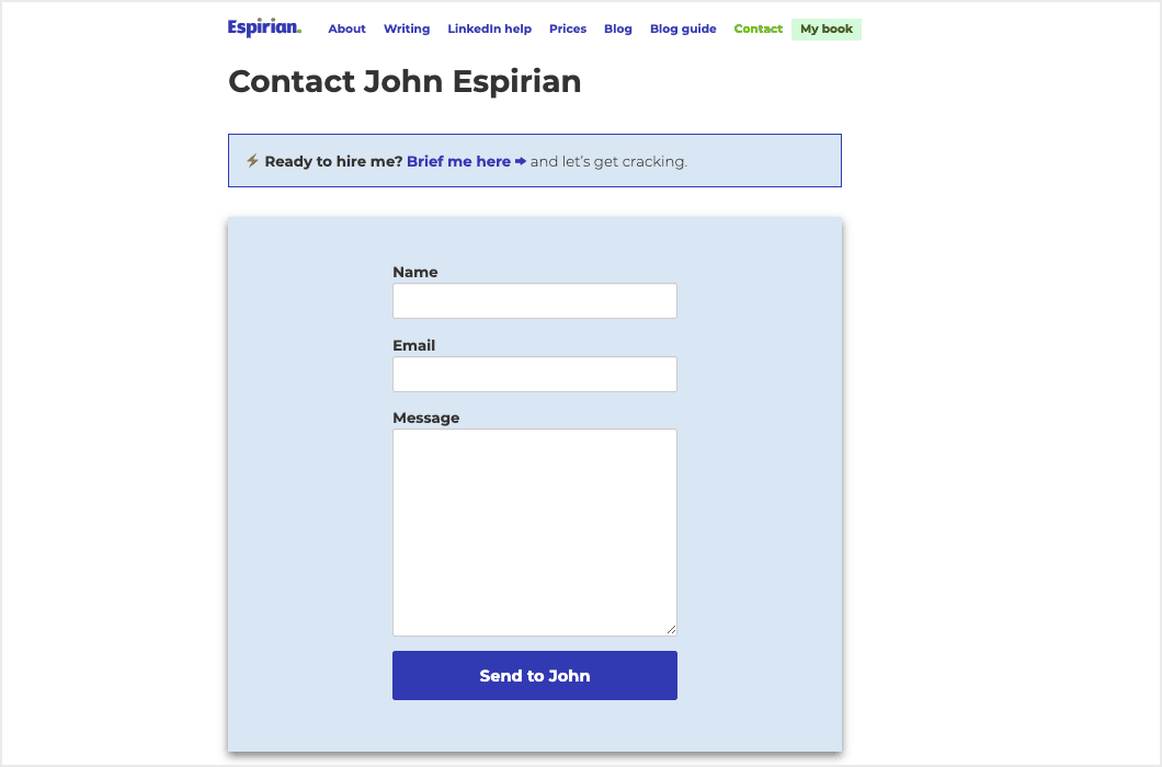
For the ultimate short contact form, check out John Espirian’s contact page where he asks for just your name, email address, and message.
It’s a reminder not to ask for information you don’t require if you want to get more form conversions.
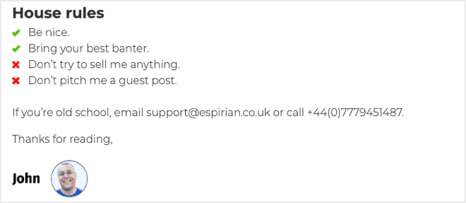
Even though it’s short, the form fits with John’s branding and business as a technical copywriter. And for those “old school” people who prefer not to use a form, he provides his email address and phone number below the form:
6. Yeti
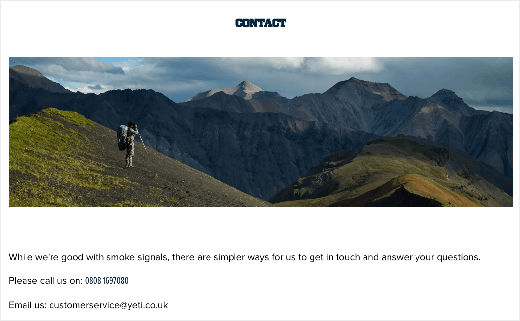
Yeti has a great contact page that starts with a lovely scenic image, which fits perfectly with their outdoor branding.
Underneath is a funny intro line that also fits with their brand: “While we’re good with smoke signals, there are simpler ways for us to get in touch and answer your questions.”
Then they provide 3 contact options: phone, email, or a simple contact form.
7. PayPal
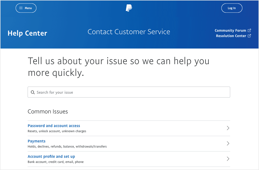
The PayPal Contact Us Page uses menu-driven options to direct you to the correct team.
They start the page with a welcome line that sets expectations that they can help you quickly: “Tell us about your issue so we can help you more quickly.”
Then you have a choice to search for your issue or click one of the options, like Password and account access or Account profile and set up, so that your inquiry goes to the right team.
Underneath the smart form, there’s a choice of further contact options, including Chat, Email, Phone, and a Community Forum:
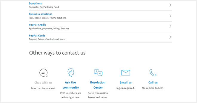
Either way, they’ve covered all angles.
8. Beardbrand
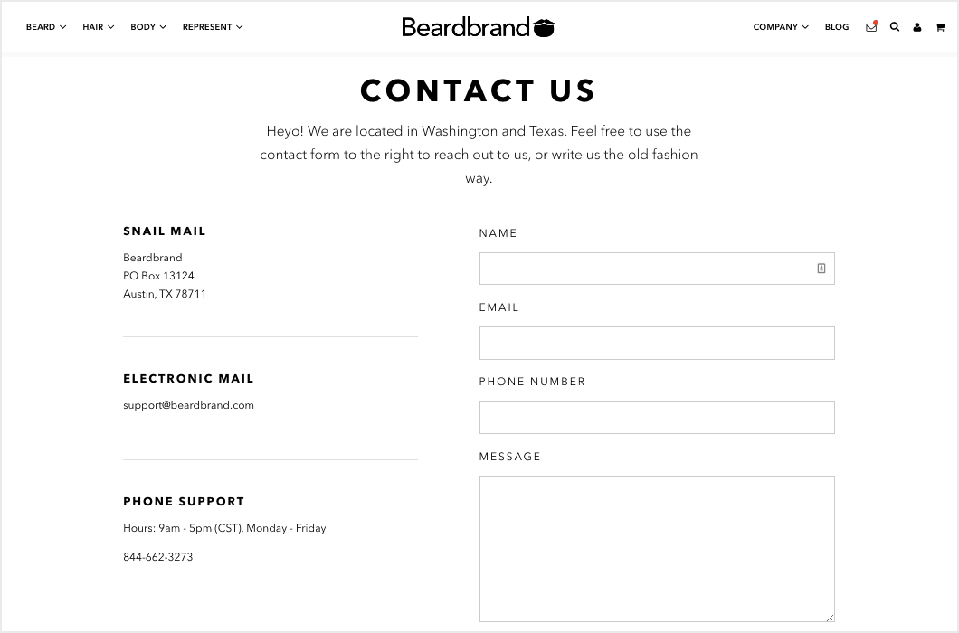
The Beardbrand Contact Us Page is in keeping with the rest of their site where they use minimal black and white for navigation and descriptions, and then let their product images shine in full color.
It’s a reminder that you don’t need to have an elaborate eye catching design and that using simple text with plenty of white space can be just as effective, as long as it’s in keeping with the rest of your site.
9. Wonderlass
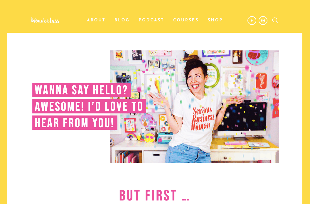
The Wonderlass Contact Page starts with a warm welcome to encourage you to get in touch.
Quickly followed with a “But first…” message.
Underneath, Allison lists a few reasons why you shouldn’t get in touch.
For example, she explains that she doesn’t have time to give personalized advice to everyone via her contact page. Instead, she directs visitors seeking advice to check out her podcasts and courses. This is an excellent time-saver for both sides and sets expectations from the start.
Allison finishes her contact page with a contact form where she asks for typical info like your name, email address, and message. But there’s also a drop-down box to select your reason for contacting her:
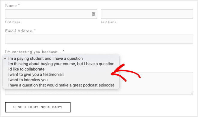
Again, this implies, that you should only contact her for one these reasons, and that anything else will be ignored.
10. Brandaffair
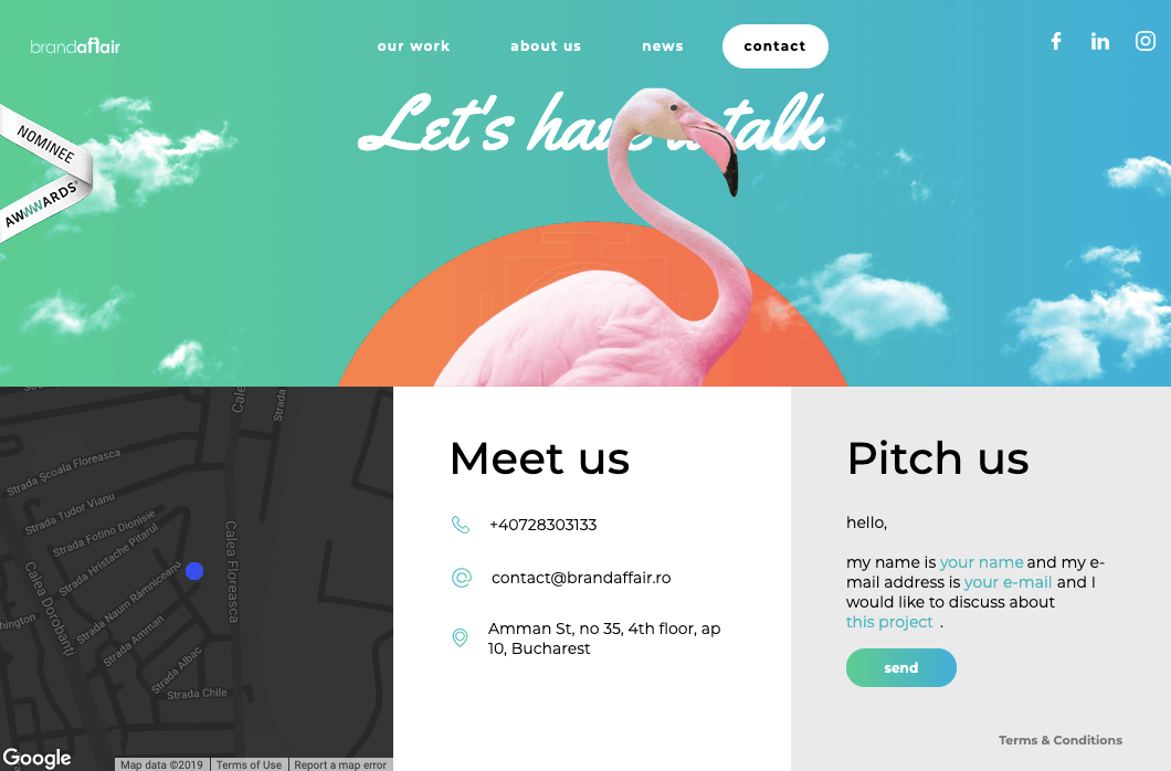
The Brandaffair Contact Page is quite different. But then again, they are a creative agency.
They’ve designed an interactive fill-in-the-blanks type form:
Hello, my name is [your name] and my email address is [your email] and I would like to discuss about [this project].
Instead of completing form fields in a typical form like we’ve seen in the other examples, they gather information by filling in the blanks in a sentence.
What’s pleasing here is that Brandaffair have kept the web design of the page in line with the rest of the site and made all the contact information easy to access.
Back to the top
Contact Page FAQs
Still have a few questions before you get started creating your own contact page? In this section we’ll tackle some of the most common questions about contact pages.
What is a contact page, exactly?
A contact page is one of the main pages on a website. It allows visitors to contact the site owner, or a specific department, such as sales or support team. Usually it will include a contact form so visitors can easily get in touch with the website owners.
Why is contact information important on a website?
Contact pages are typically one of the most-visited pages on a website, along with the Homepage, the About Us page and the Blog page.
Research from Komarketing found that 64% of visitors want to see the website’s contact details when they land on a new site. Having a contact page instills trust that real people manage the site and can be contacted.
So make sure your contact page is easy to find from your menu (either at the top or bottom of the page) and can be accessed from any page on your site.
What should be on a contact us page?
A contact page should provide a way for visitors to get in touch with you. So you should include at least one of the following options:
- An email address. Some sites make this a clickable link while others use plain text.
- A physical address. Some sites also include a map showing directions.
- A contact form where visitors enter their name, email address, and their inquiry before clicking a submit or send button. Some sites add more fields, but take care not to ask for too much unnecessary information.
- A telephone number (or several numbers for different departments like sales and support). Some sites now include clickable phone numbers so that users can dial directly from their smart phone.
- A Live Chat message box. These are popular on ecommerce sites and service-based businesses that need to respond quickly.
- Links to social media accounts. These are often displayed as icons or buttons for visitors to click.
You probably don’t need ALL those options on your site. Just a contact form is perfect for most sites.
It’s also helpful to your visitors if you set some expectations and let them know how long they’ll typically have to wait for a response.
What fields should you include on your contact form?
The fewer fields you have, the more people will fill out your form.
To reduce form abandonment, it’s smart to only ask for information you absolutely need. For many bloggers, you’ll only need to ask for the visitor’s:
That’s all!
If you find that you often have to ask the same follow-up questions, or you’re getting too many irrelevant messages, then it’d be smart to consider asking for more information up front.
For example, you might want to weed out bad leads by asking for their budget first, or ask people when is the best time to reach them on the phone if you need to call them to follow up.
This will save time for you and your visitors.
Where should you put a contact form on your contact page?
To make it easy for your visitors to contact you, you should include the form at the top of the page so it can be easily found without scrolling or searching.
Your contact form should be the first thing they see when the contact page loads.
How do I add a Google Map to my website?
This is easy to do and will be very helpful to your visitors if you have a physical location they’re looking to visit.
It will also save you time, since you won’t have to deal with people contacting you to ask for directions.
Here’s a step-by-step tutorial on how to display a map on your contact us page.
Back to the top
Hopefully you’re feeling inspired after checking out all these cool Contact Us pages!
What’s your favorite Contact Us page? Let us know in the comments below.
And don’t forget to sign up to our email newsletter so you can get useful content like this sent right to your inbox!
Keep reading the article at Blog Tyrant. The article was originally written by keri on 2019-12-20 18:30:56.
The article was hand-picked and curated for you by the Editorial Team of WP Archives.

