As usual, I am always on the lookout for plugins that allow users to have fun with their websites. I like to mix it up from time to time here on the Tavern and not be all-business-all-the-time. And, that is where the new Adrian plugin comes in. Its goal is to take all of the hard work out of selecting a font pairing for end-users.
The plugin derives its name from Swiss typeface designer Adrian Johann Frutiger. The plugin author, who wishes to remain anonymous, said the typographer was one of their favorites.
“All plugins have such serious names stuffed with SEO keywords, and I just wanted something fun,” they added.
Instead of the typical route of submitting it to the WordPress.org directory, the author decided to launch a one-off site to showcase the plugin. The cost runs the price of simply subscribing to an email list to access the download.
Adrian is essentially a font selector. However, instead of picking each font for various theme elements, users can select from curated pairings. And, taking it one step more, it provides unique names for all of them.
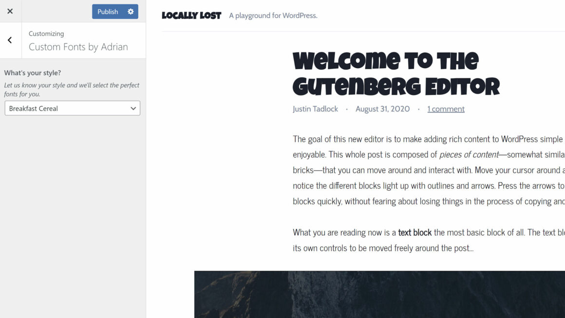
For example, the Breakfast Cereal (yes, that is the actual name) option uses the big and bold Luckiest Guy font for headings alongside News Cycle for body copy.
If nothing else, the plugin is simply a treat to test because of its fun names. With options like Cherry Soda, Cowboy, and Hollywood Lights, it adds a little flavor to the entire process.
“I think there are lots of people who would rather you hand them an option rather the ability to make the decisions themselves,” said the plugin author. “No one in their right mind looks at the 1.2K fonts in Google Fonts and says, ‘I can’t wait to pick a font pairing.’ It’s overwhelming and out of most people’s depth.”
Even as a former full-time theme designer, this could be a tedious job. I would often spend hours tinkering with pairings, attempting to find the right personality for a design.
The plugin takes most of that work and boils it down to a little more than three dozen options.
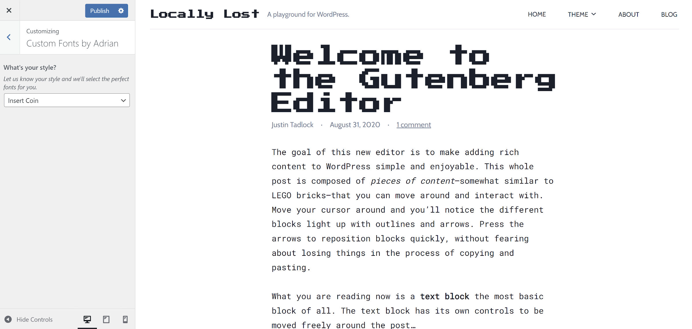
There is a little something for everyone. For example, if you want a retro gaming feel, the Insert Coin pairing of the pixelated Press Start 2P font for headings and Roboto Mono for text can bring a little nostalgia to your site.
 Insert Coin retro-gaming font pairing.
The plugin is built on top of the WordPress customizer. It adds a single section and control for selecting the font pairing.
A downside to this might be for users currently running a block theme alongside the Gutenberg plugin. Menu links to access the customizer screen are hidden. However, there is still a button on the Themes admin screen, at least for now.
 Customize button for the active theme.
One of the things I like about the plugin is that it does not ruin body copy. Far too often, such systems try to get too fancy with text for longer-form content, and they utterly fail. Instead, Adrian keeps this in check. The fonts that veer into the wilder territory are limited to headings.
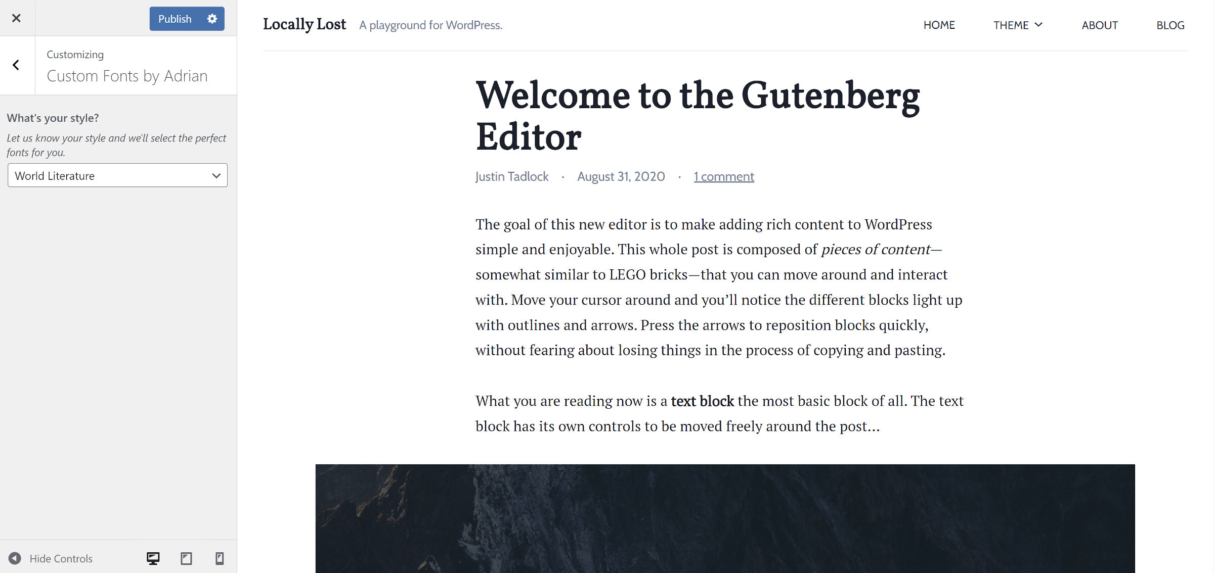
The plugin is not all fun and games. It has its serious side too. The World Literature option that pairs Vollkorn and PT Serif is elegant, creating an enjoyable reading experience.
 World Literature font pairing.
The Novella option is similar, replacing Vollkorn with EB Garamond.
The most irritating thing about the plugin is that it requires a full refresh of the customizer preview panel each time the user selects a new font. This is par for the course, though. Most themes and plugins I have tested for WordPress have never utilized the customizer to its fullest potential.
With minimal JavaScript and the Web Font Loader script, the plugin could load the chosen font on the fly. It would make the experience much smoother. However, because the customizer is going the way of the dinosaur, I would use my time and effort to focus on a solution geared toward Full Site Editing.
Success may vary from theme to theme. Typically, I use a three-font system with most of my theme design work. One font family for headings, one for body copy, and another for secondary text. While the plugin worked well enough to overrule the first two, it failed to alter the third. This is not necessarily Adrian’s fault because it does not know the class name it must target in this instance.
This is also the reason I favor design-related features falling squarely on the shoulders of theme authors. I like the forward-thinking of the plugin author — tackling font decisions in a way that does not overload end-users with seemingly infinite choices. However, I would rather see the system coming from the theme.
With that said, I could be singing a different tune as the global styles system matures. It has not yet shipped with WordPress, but it could land in version 5.9 later this year for block theme users. As the community builds more standards around the feature, there may be more opportunities for plugins like Adrian to add features.
The plugin author is not quite ready to go that route yet. “I imagine that this can be ported pretty easily to the new FSE interface if I happen to get enough users to keep it going,” they said. “Finding someone who knows the new system and is a freelancer is next to impossible, so I thought why not test the idea the old way.”
For now, the plugin does its job pretty well, and most users still rely on the customizer. There is still plenty of time to figure out the rest.
Like this:
Like Loading…
Keep reading the article at WP Tavern. The article was originally written by Justin Tadlock on 2021-10-13 20:14:13.
The article was hand-picked and curated for you by the Editorial Team of WP Archives.

