WooCommerce can make setting up an online store easy. However, if you want to attract customers and increase conversions, you’ll also need to make sure your website is mobile-friendly.
Fortunately, the process of preparing your WooCommerce site for mobile devices is not as daunting as it might first appear. To get you started, Google has a test you can use to check your current site for mobile readiness. You can then take some simple steps such as optimizing your product images and adjusting your lead generation strategies.
In this article, we’ll discuss why it’s important to have a mobile-ready WooCommerce website. We’ll then look at the strategies you can use to achieve that. Let’s get started!
The importance of mobile-ready e-commerce websites
Approximately 96% of Americans have a smartphone, and the numbers are similar in most countries around the world. For many of those people, their phone is their primary device used for accessing the internet.
This increase in smartphone use has led to a rise in shopping on mobile devices. More and more people are using their phones to buy items they would have purchased on their desktops or laptops in the past. This is why e-commerce websites have to be mobile-ready. Sites that don’t render properly on smaller screens provide a poorer user experience, and can drive potential customers away.
On the other hand, online retailers with responsive (mobile-ready) sites see an increase in engagement of up to 85%. This can have a significant impact on your ability to build a strong customer base, and encourage conversions.
How to make your WooCommerce site mobile-ready (5 key strategies)
Understanding the importance of mobile-ready sites is a good starting point, but how can you make sure yours hits the mark? Below, we’ll look at five key strategies you can use to transform your online store.
1. Check your website with the Google Mobile-Friendly Test
The first thing you’ll need to do is find out how mobile-ready your WooCommerce site currently is. There are a lot of tools you can use for this, but the Google Mobile-Friendly Test is one of the best options. As this test was developed by Google, it looks for everything the search engine uses to rank mobile sites.
What’s more, the test is very simple to use. You simply provide the URL of your website and click on Test URL:
The tool will then analyze your online store, and generate a report that lets you know how well it performs on mobile devices. If there are any loading issues, you can see further information by clicking on View Details next to the Page Loading Issues warning. This will let you know if there were any resources that could not be loaded and why.
There are six other errors the test is able to identify:
- Uses incompatible plugins
- Viewport not set
- Viewport not set to ‘device-width’
- Content wider than the screen
- Text too small to read
- Clickable elements too close together
You can use the information from this test to start making adjustments to your website. Fixing some of these errors may require working with a web developer or adjusting the code on your website. However, others can be resolved using the following strategies.
2. Optimize your product images
Images are a vital part of any e-commerce website, because potential customers want to see what they are going to buy. Great product photos grab the attention of visitors, provide information, and boost your conversion rates.
However, not optimizing your images for mobile devices can create problems. Your high-quality photos need to look impressive, but not slow down your website. They also need to adjust for easy viewing on smaller screens.
Fortunately, there are a few ways you can start optimizing your images. Compressing them is the first step, as it decreases their size and speeds up page loading. You can also use web-based tools like TinyPNG to compress images before uploading them to your website:

If you want automatic compression, there are WordPress plugins you can try as well.
You can also use lazy loading to optimize your images. When enabled, this tells the users’ browsers to not load images until they actually need to be viewed. Delaying this loading makes your website faster without compromising your images’ quality. There are many plugins that can help you do this.
3. Consider mobile-friendly WordPress plugins
Plugins are a staple of most WordPress websites, but not all of them are designed properly for mobile sites. The extra features they provide might not scale or function correctly on smaller screens.
Fortunately, you’ll know if this is a problem because the Google Mobile-Friendly Test will highlight what plugins are creating errors. If one or more of your site’s plugins is causing issues, you may need to look for mobile-friendly alternatives. Contact form plugins can often be a problem, for example. However, there are many popular options that are mobile-ready, such as Contact Form 7.
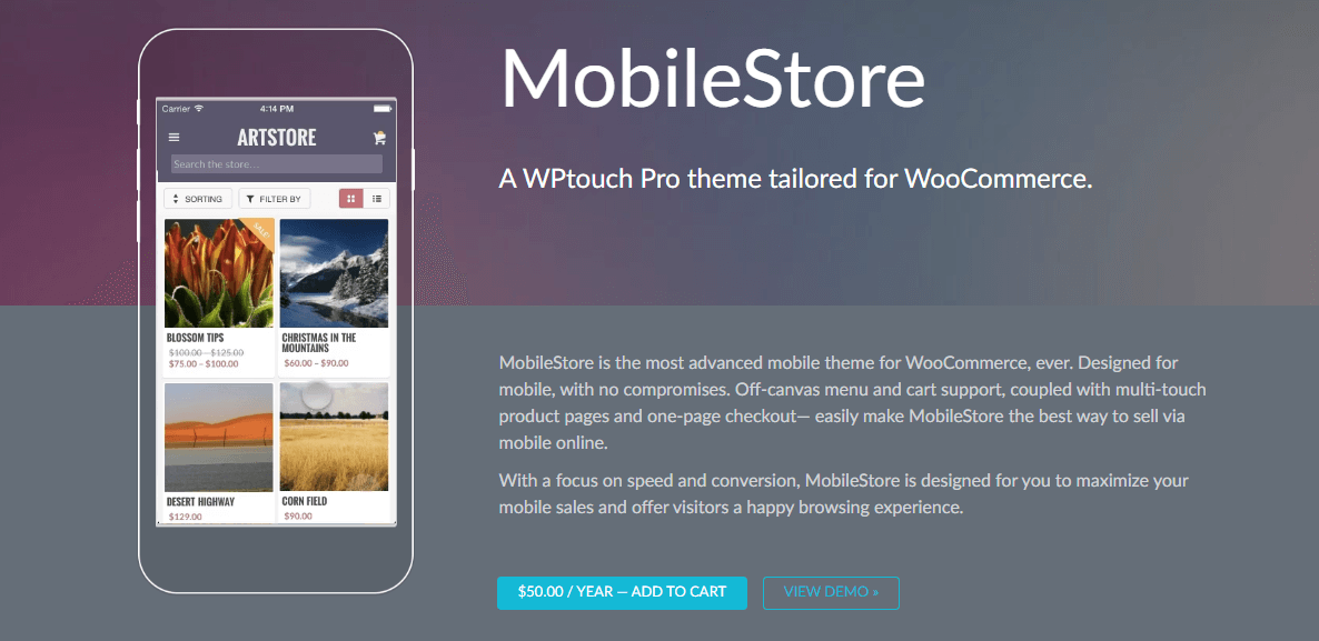
While using mobile-friendly plugins is a good first step, you might also consider solutions that turn your website into the ultimate mobile store. Plugins such as WPtouch can transform your website into a quasi-mobile app. This ensures that your website will render correctly on mobile screens, and should take care of many potential errors.

If you are changing your site’s plugins, make sure to test the new configuration thoroughly on a staging site first. Once you are happy with how a plugin works on your website, you can also run the Google Mobile-Friendly Test again to make sure no new errors have been introduced.
4. Remove lead generation popups
Lead generation is vital for all online businesses. However, you have to be careful with how you generate leads on mobile websites. Lead generation popups are a commonly-used technique, particularly for email opt-ins. However, these popups could impact your store’s mobile-friendliness.
Google frowns on the use of popups that make it hard for mobile users to access website content. If you have a popup that covers the majority of your mobile site’s page, for example, that can lead to a poor user experience. You might also see an increase in your bounce rates.
To keep both Google and mobile users happy, consider replacing lead generation popups with banners or Call-to-Action (CTA) buttons. Text links within your content can also help send users to the right locations.

Of course, you can still use popups if they are mobile-friendly. If you use an email marketing provider to create your opt-in forms, you can often configure them to be mobile-responsive. Still, after adding a popup to your website, you’ll need to test it to make sure users can easily close it on smaller screens.
5. Make your menu easy to navigate
Another vital part of your website is its navigation. An intuitive and easy-to-use main menu can make or break your online store, as it impacts how well customers can find what they’re looking for.
The structure of your menu becomes even more important on a mobile site, as there is limited space to work with. On your mobile WooCommerce store, your main menu might need to be simplified and streamlined. Most crucially, you’ll want to reduce the number of clicks required to navigate around the site. This makes it easier for users to find what they need on their phones.
Reducing the number of options in each level of the menu is also a smart strategy. Too many choices can lead to small text that’s hard to read, or clickable elements that are too close together. Both of these issues make your e-commerce store a lot less usable on mobile devices.

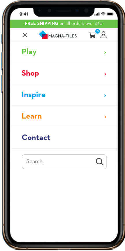
This is why ‘hamburger menus’ are extremely popular options on mobile sites. This type of menu is minimized until selected, and then covers most or all of the screen, providing the most space possible for displaying menu items. When selecting a theme for your WooCommerce store, it’s worth considering whether it allows for this type of menu.
Conclusion
With more people using their phones to access the internet than ever before, it makes sense to have a mobile-ready WooCommerce site. While you don’t need to replace your desktop site with a mobile one, you should take steps to adjust it so that it works well on all screen sizes. This can speed up your online store and provide a better customer experience.
To prepare your website for mobile devices, you may want to:
- Test your website with the Google Mobile-Friendly Test.
- Optimize your product images.
- Consider mobile-friendly WordPress plugins.
- Remove lead generation popups.
- Make your menu easy to navigate.
Do you have any questions about making your WooCommerce website mobile-ready? Let us know in the comments below!
Image credit: QuinceCreative.
Keep reading the article at ManageWP. The article was originally written by Will Morris on 2020-06-30 11:00:30.
The article was hand-picked and curated for you by the Editorial Team of WP Archives.

